Quick Design History: House Industries #ThrowbackThursday
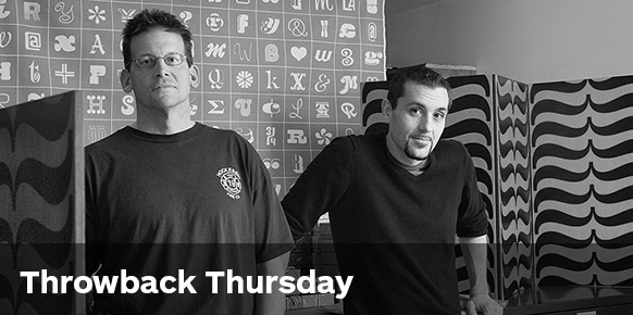
Originally starting out as Brand Design co.inc in 1993, Andy Cruz and Rich Roat worked out of a spare room before creating House Industries in 1994, a prolific type foundry that’s made a major impact on the world of design.
One of their first clients was Warner Brothers Records who saw some of their fonts and placed an order, although they had only actually created enough letters to spell out the name of the font! As the company grew they added the ridiculously talented Ken Barber—two years later in 1996.
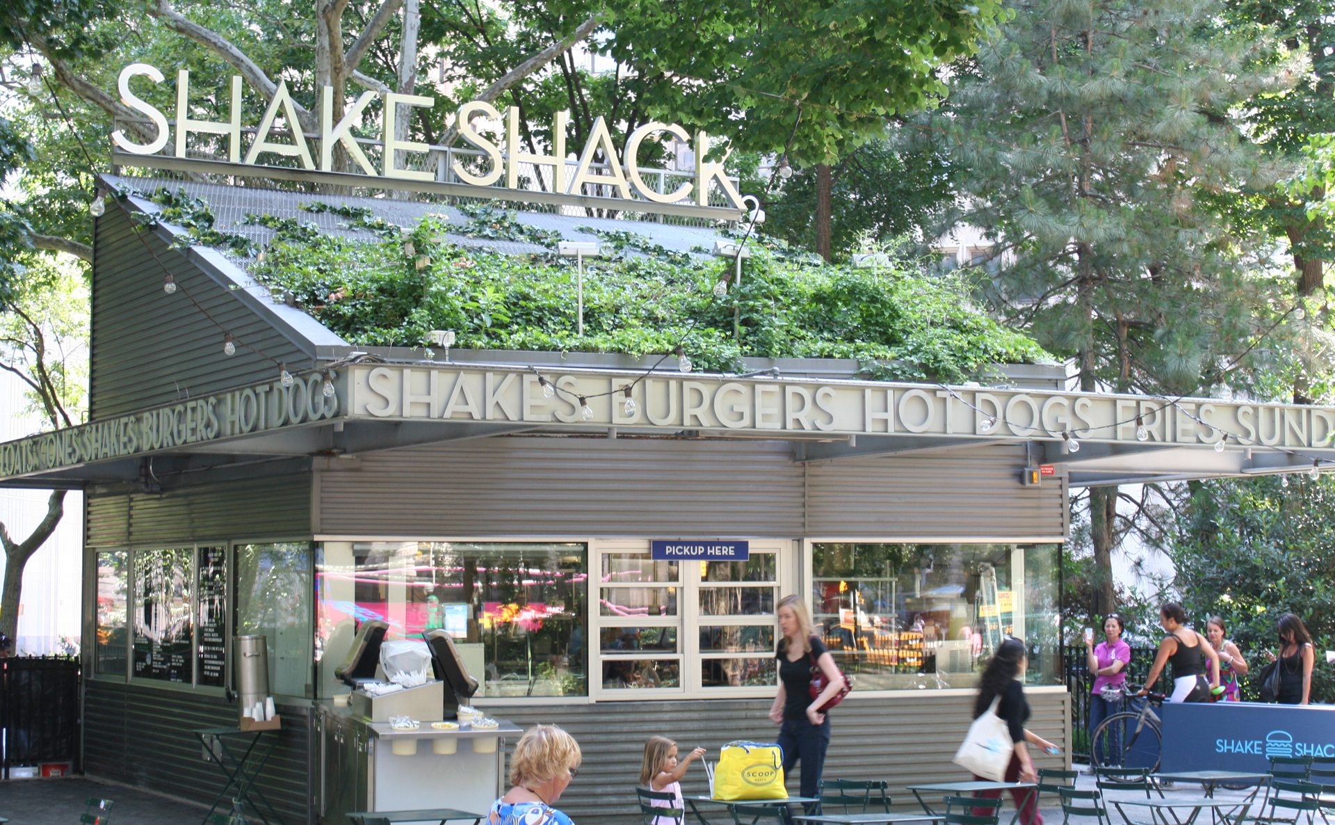
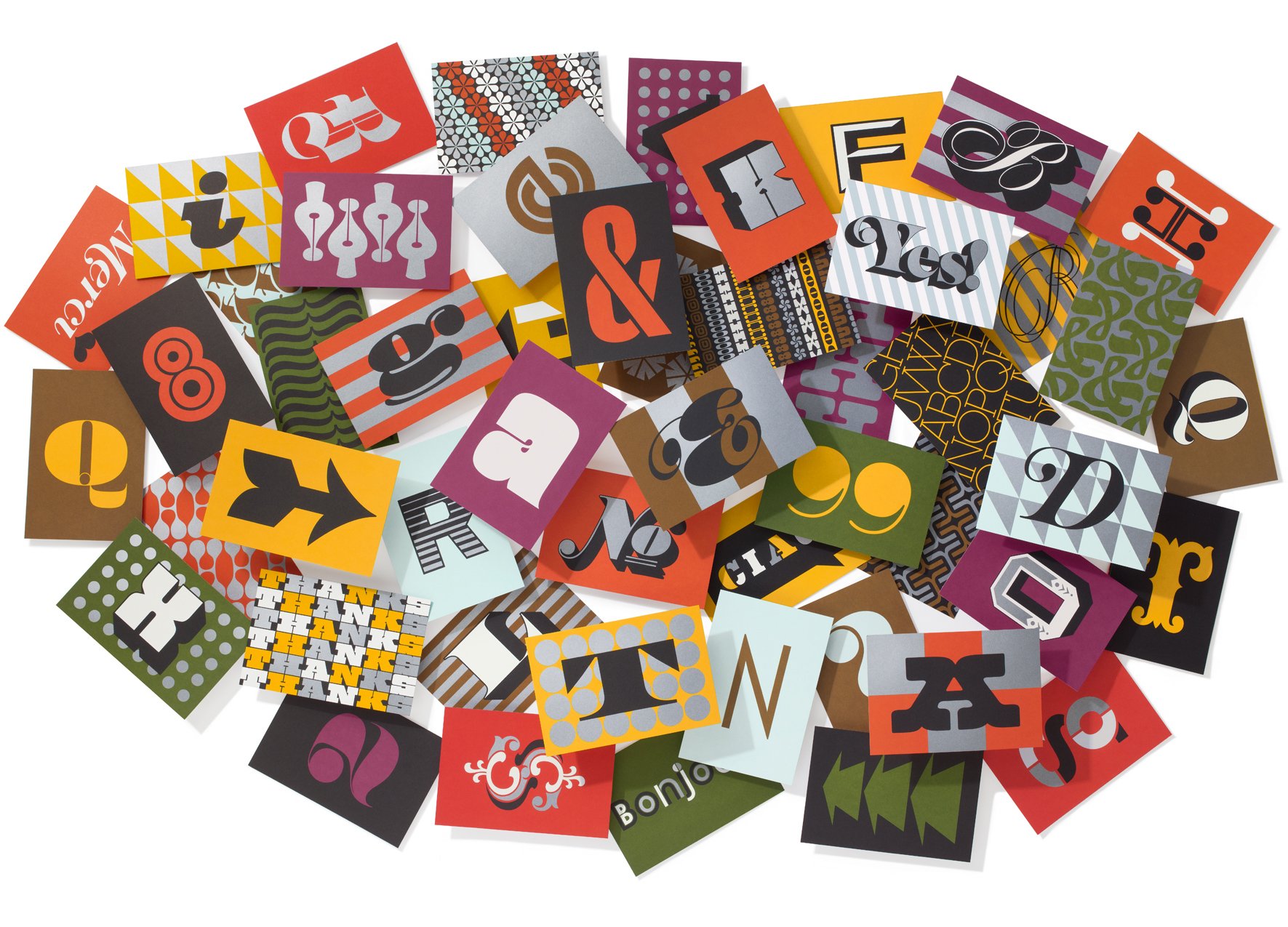 Realising early on that they preferred to embark on projects that excited them, they have carved a niche for themselves creating textiles, toys, homewares and beautiful products of all kinds. Most of which are already sold out! Not to mention typefaces that can found on billboards, greeting cards, watch faces and of course on the signage for Shake Shack.
Always keen to break out the ink and brushes and get creative with traditional techniques, it’s their love of the craft that gives them their unique feel.
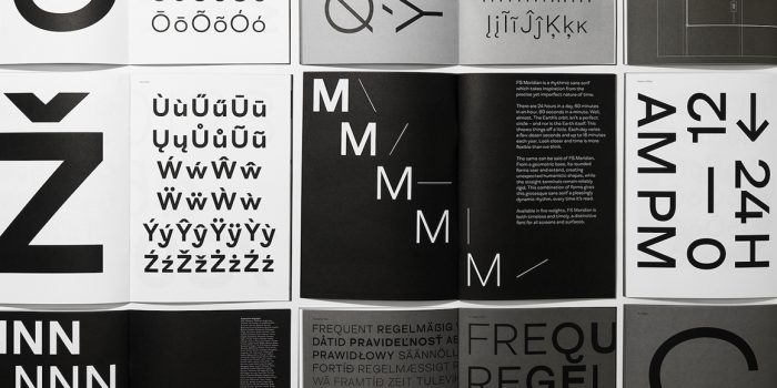
Neutraface is possibly their most widely recognised and used typeface, which beautifully illustrates their approach. Inspired by the work of Architect Richard Neutra, House Industries consulted with Neutra’s son Dion and scoured the archives of photographer Julius Shulman studying the limited hints of signage and lettering used in Neutras’ work. From these hints an alphabet was built along with a complimentary lowercase set. This typeface supports over two dozen languages and has been developed into five weights with alternate variations as well as a titling font. But honestly that’s just the tip of the iceberg, when it comes to beautiful letterforms House Industries is the typographical Aladdin’s cave.
I love House Industries because I like all things Americana. Skateboarding, punk rock and cheesy metal bands. I like the showiness of Vegas neons and the hand rendered TV showcards of the 50s and 60s. I like hot rods and I like hot dogs. I like the skyscrapers of New York as much as I like their strip malls and road side diners.
There’s a feeling you get from that kind of honest commercial art, and they seem to be able to tap into that vein in a powerfully aesthetic way.
More likely to have their noses in an issue of MAD magazine than Creative Review, they are proudly blue collar, unsophisticated and most of all…they’re having fun!
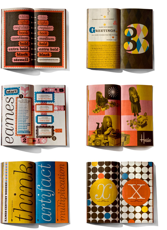
They’re doing what they love and they’re unapologetic about it. They overindulge with printing techniques and packaging. Their book is stunning and their postcards and type samplers are beautifully collectible. They build stories, commission artwork, dig through archives and work with their heroes. Digging though the libraries of Ray and Charles Eames, Alexander Girard, Ed ‘Big Daddy’ Roth and Ed Benguiat to collaborate and release products and font collections. These guys are getting it right.
Learn more about House Industries on their website and Twitter. And be sure to browse through my Pinterest curation of my favourite House Industries projects!
Posts you might like
In graphic design, quite a few decisions happen behind the scenes that clients may not grasp the importance of, yet have a huge...
It’s that time of year again! As the new year approaches, it’s become somewhat of a tradition for us to look back at our...
We all know that sometimes finding the perfect typography for a design project can be like finding a needle in a...
Dipped your toes into the world of graphic design? You'll know that typography is something that underpins almost every aspect...
Considering how much the world has changed since this time last year, making general predictions for what the next 12 months have...
Whether you’re a student or a recent graduate, living on a tight budget means looking for savings wherever you can, including...
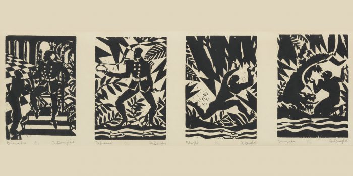
Aaron Douglas was a leading artist of the Harlem Renaissance, also known as the New Negro Movement. Douglas, along with the...
You need some typography for your project and you're on a tight budget. You'd love that stunning sans serif or stylish...
Want to win some amazing prizes and stay in the loop with all things Shillington? Sign up to our newsletter to automatically go in the draw.