Japanese Graphic Design Characteristics & Examples
It’s no secret that Japanese design—encompassing architecture, fashion and, of course, graphic design—is renowned all over the world. Japanese graphic design is a hugely diverse mix of different styles, approaches and methodologies. This, combined with a very Japanese approach to creating and the idiosyncrasies of Japanese culture, means that Japanese graphic design has an incredibly unique style.
Read on to find out more about what makes Japanese graphic design truly special and some incredible examples of Japanese graphic designers from the past and present.
History
A very brief history of the last 200 years of Japan is essential to understanding why Japanese graphic design is where it is today. Prior to the Meiji Era, which began in 1868, Japan had closed borders. This meant that there was hardly any influence from outside the country—which allowed Japanese art and design to truly flourish and take on its own, unique identity.
With the fall of the Tokogawa shogunate and opening of Japan’s borders, Japan was now free to trade with the outside world and a reciprocal trade of culture began. This not only had a profound effect on Japanese art and design, but also a profound effect on what is considered “Western” art and design. Japanese art, particularly Ukiyo-e woodblock prints, inspired artists the world over. Most famously, the French Post-Impressionists Claude Monet and Edgar Degas.
The next important step in the development of Japanese graphic design was during the Post-War years. Between the 1950s and 1980s, Japan underwent an incredible economic boom, becoming the third largest economy in the world. Industrialisation and the growth of manufacturing in the country laid the path for the exploration of the European concepts of Constructivism and the Bauhaus to make its way into Japanese design. The strong geometric shapes related to these concepts were combined with Japanese symbolism to create something that, though inspired by European concepts, were concretely Japanese.
Then in the 1990s, Japanese graphic design exploded! Fully embracing Postmodernism, Japanese designers further carved their own unique ideals into graphic design. The 1991/92 economic collapse that led the country into what is called The Lost Decades, which lasted until 2010, also inspired Japanese graphic designers to imbue their design with a sense of positivity. Allowing the country, even when faced with economic turmoil, to embrace something that was uniquely Japanese.
Characteristics and Traits
As a result of Japan’s unique history and equally unique culture, which is a fascinating study in its own right has led to Japanese graphic design being its entire own genre in the field of graphic design. Everything from folklore to religion, flowers to technology have played a part in how Japanese graphic design has looked throughout history and even how it looks today in the 2020s. We will now take an in-depth look into some of the characteristics and traits that make Japanese graphic design exactly what it is.
Minimalism
Japanese Minimalism is born from the country’s Zen Buddhist tradition and its embodiment of “less is more”. Japanese Minimalism rejects modern consumerism and aims to keep life, and in our case design, as uncluttered and simple as possible. Despite sharing similarities and actually inspiring what is referred to as Modernism and Western Minimalism, Japanese Minimalism is regarded as being more intuitive, asymmetric, warm and fluid. Its aesthetics are clean, but not sterile.
Given the religious tradition and more modern interpretations on Minimalism in Japan, it has found its way into Japanese graphic design. We can see the principles of Japanese graphic design across the spectrum of design—from packaging to posters.
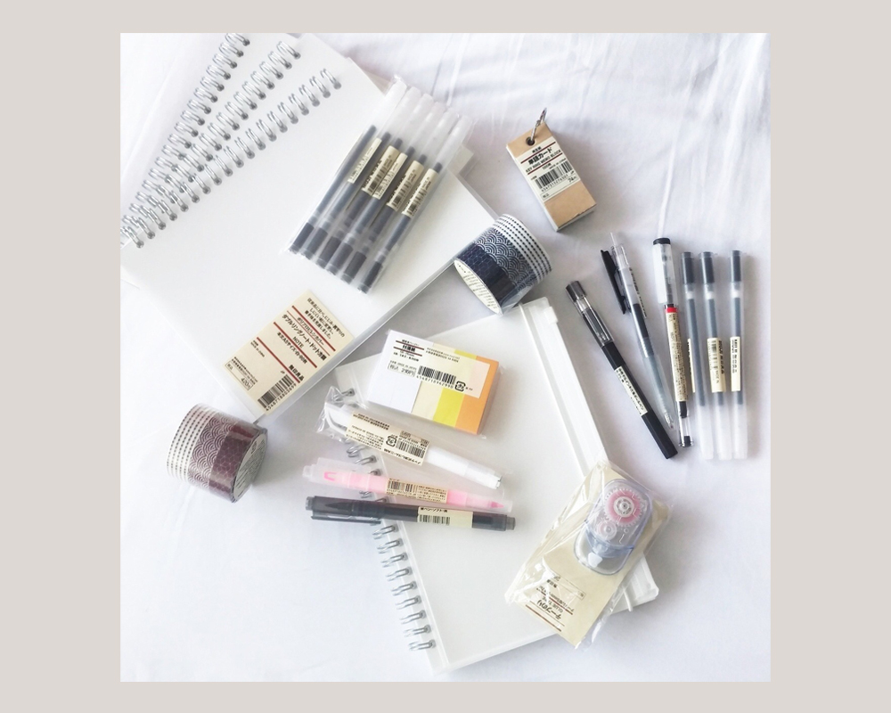
Though there are many examples we can choose from, we think the work of art director Kenya Hara for the now-global Japanese brand Muji exemplifies this perfectly. One of Muji’s founding principles is Minimalism and the company runs a “no-brand” or “no logo” policy across all its products—so it comes as no surprise that Hara’s design for the company is the same. Check out some of the brand’s stationery packaging to see exactly what we mean.
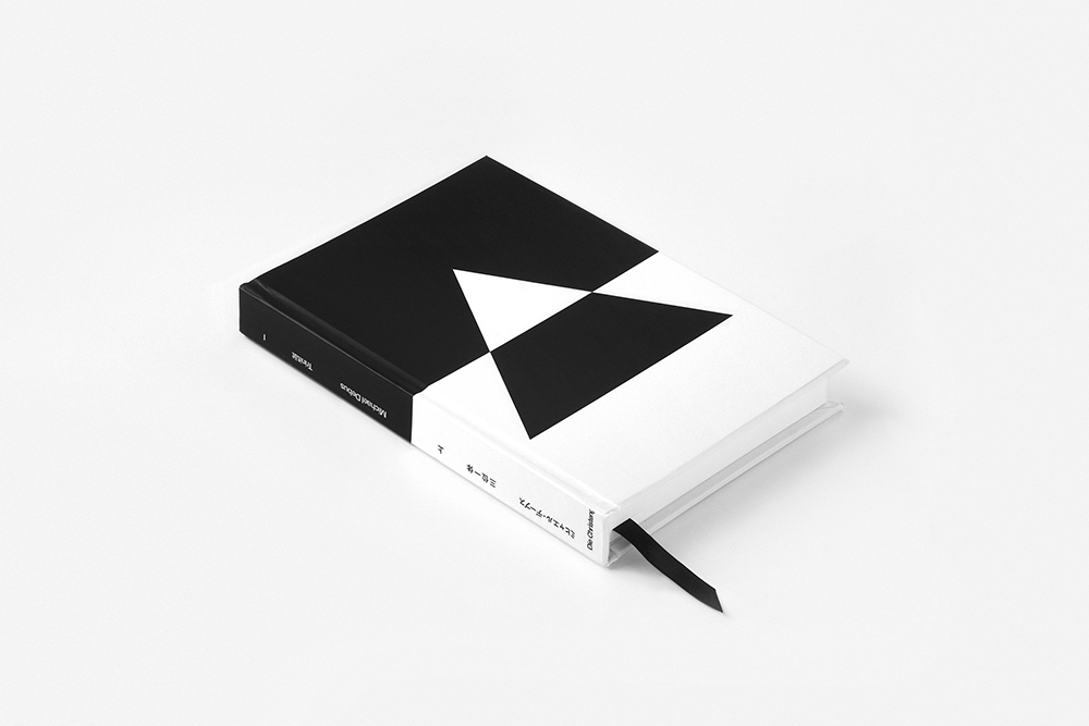
Minimalism in Japanese graphic design goes beyond Hara and Muji though. We love this Minimalist approach Yuta Takahasi took for the editorial of a special Japanese version of Trinität by German philosopher Michael Debus. Takahasi uses simple shapes and a monochrome colour palette to beautiful, Minimalist effect.
Kawaii
On the opposite end of the spectrum from Japanese Minimalism and Zen Buddhism is the concept of Kawaii. Kawaii is the culture of cuteness and since the 1970s has exploded into Japanese popular culture and influenced the way that the world sees Japan and its culture. Kawaii covers everything from global phenomenons like Pikachu and Hello Kitty to handwriting and particular fashions.
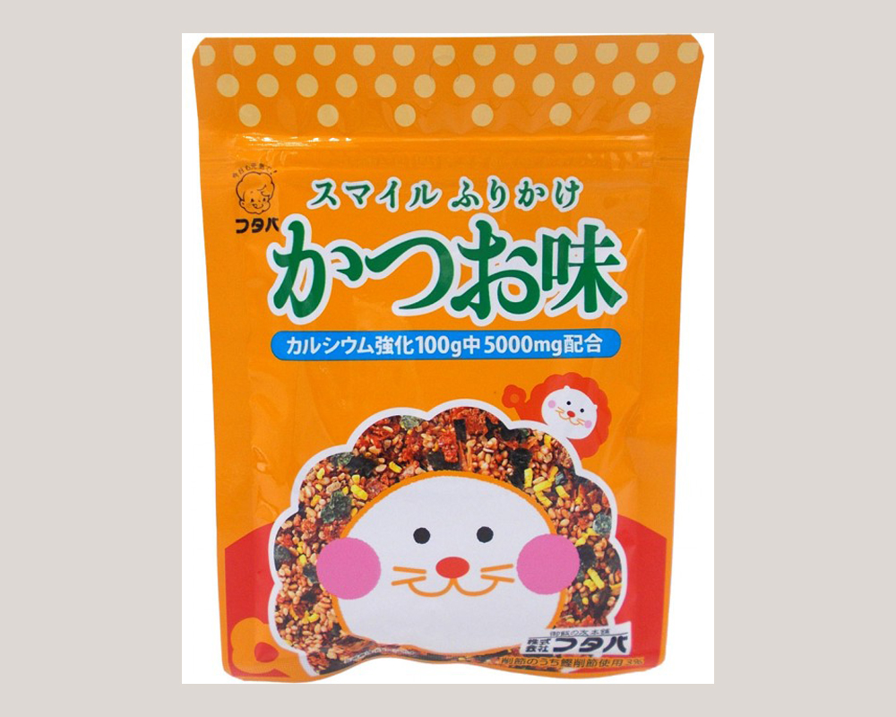
Given its predominance of Japanese popular culture, it comes as no surprise that Kawaii has also had an influence on Japanese graphic design and Japanese packaging in particular. Take a look at this packaging for a furikake of bonito flakes and sesame from an unknown designer—the Kawaii influence is totally unmissable. What has a lion got to do with furikake? Nothing, but we really want that furikake regardless.
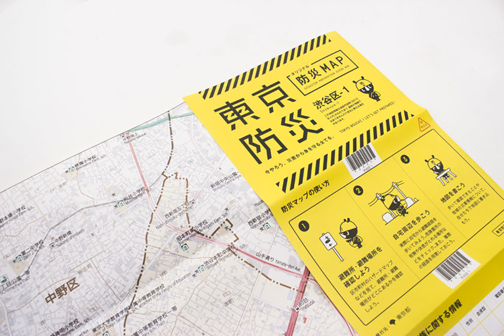
Though it’s not just food packaging that has got the Kawaii-treatment. For instance, this Tokyo Bosai (a manual for disaster preparedness in Tokyo) which teaches residents of the Japanese capital what to do in the event of an earthquake features a cute rhino called Bosai-kun. The manual and its rhino were designed by NOSIGNER, who describe themselves as a social design activist.
Kawaii-inspired Japanese graphic design has probably become the best known outside of Japan—which means the other distinctive elements and influences that make up Japanese graphic design can be easily overlooked.
Custom Typography
The Japanese language is very complex—it has over 2000 characters across three different alphabets; Kanji, Hiragana and Katakana. These three alphabets can also all be used within one sentence. In other words, there’s a lot more to think about than the 26 letters of the English language alphabet! What this does mean though is that it is hard for typographers to create typefaces—imagine the time it would take to create a specific look for each of the 2000 characters. This means that graphic designers in Japan are much more likely to use custom typography in their projects. It’s much easier to create a typeface for a few select characters.
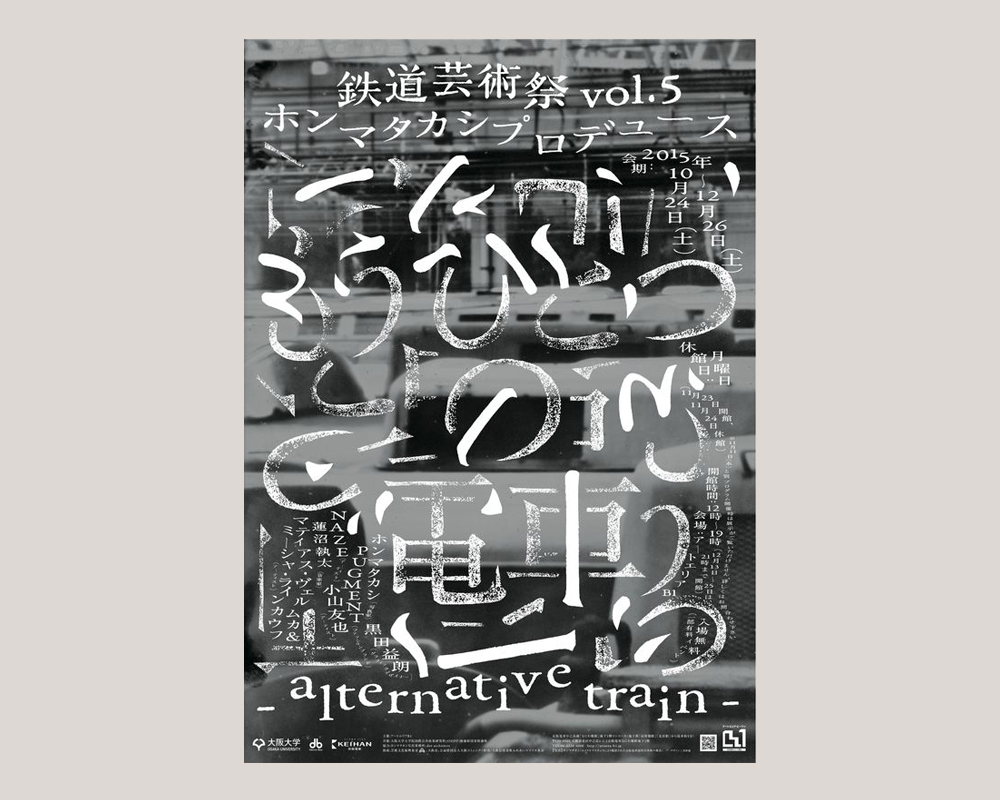
This poster by Japanese graphic designer Ryu Mieno exemplifies this perfectly. For his project Alternative Train, he created some of the type out of a rubber stamp and the rest was created by hand. This meant that his typography across the project was entirely custom and unique to the project.
Though, this is not to say that Japanese language typefaces do not exist. In 2016, three Japanese typographers on the team of Monotype, Akira Kobayashi, Kazuhiro Yamada and Ryota Doi, launched the foundry’s first original Japanese humanist sans serif typeface, Tazugane Gothic. It works together with the classic Latin typeface Neue Frutiger so that the two languages can appear seamlessly together across print and digital.
Another interesting element of Japanese graphic design and typography is the use of brushstrokes. This is a direct link to the ancient art of Shodō or Japanese calligraphy, which has been part of Japanese culture since the year 600. Shodō is still taught today in Japanese schools so it seems obvious that it would make its way into Japanese graphic design.
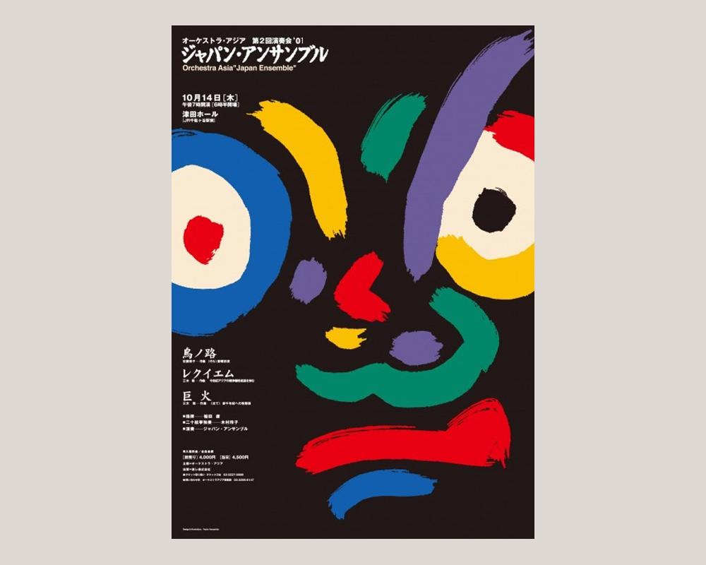
This 2001 poster for the Japan Ensemble at Orchestra Asia by designer Hideo Pedro Yamashita uses Shodō-esque brushstrokes in a clever way. Rather than being used to create typography as they usually and traditionally are, he instead uses the brushstrokes to create an abstract human face. His poster links the tradition of Shodō and the modernity of graphic design in an exceptional way.
Nature
As part of their culture, Japanese people are acutely aware of the world around them. Throughout their day-to-day lives they are aware of how the natural world is constantly changing and moving. The Japanese are well known for the celebration of nature and the seasons, which take on special, spiritual significance across the country. In fact, every year the Japanese celebrate Greenery Day (Midori no Hi) on 4 May. This is a day to commune with nature and be thankful for blessings.
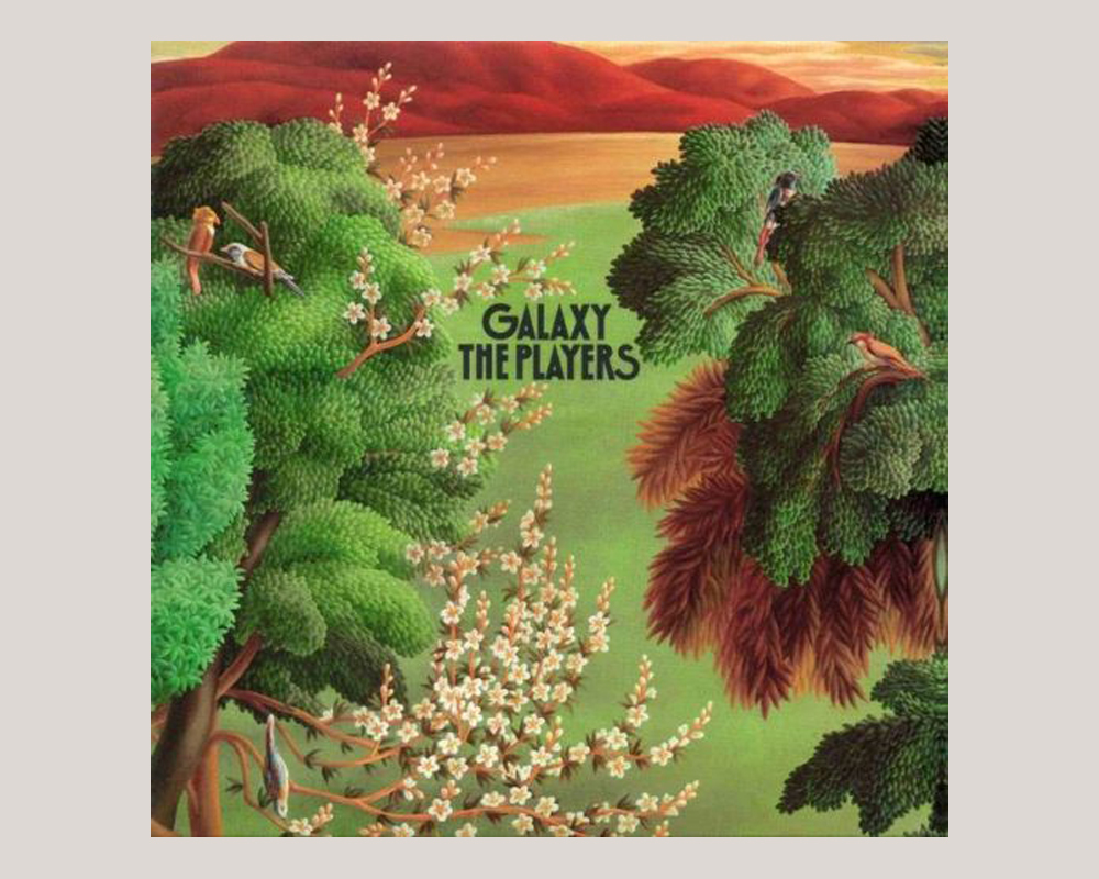
The significance of nature in Japanese life and culture also extends to graphic design. Nature and the natural world, plants, seasons and flowers, often influence colour palettes, illustrations and packaging. For instance in this record sleeve for The Players’ 1979 album Galaxy designed by Eiko Ishioka, Motoko Naruse and Tamie Okuyama.
Symbolism
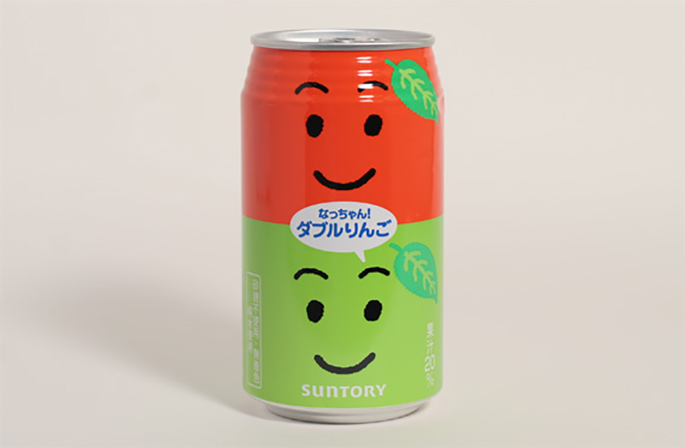
Japan has an incredible tradition of symbolism so it’s no surprise this has also found its way into Japanese graphic design. Some of these symbols are especially prevalent in contemporary design. For example, according to Japanese folklore, all things have their own spirit including inanimate objects. For this reason it’s very common for Japanese graphic designers to add faces and human qualities to brands and packaging. Take a look at this can for Suntory’s Nachan soft drink and its two smiling faces for one brilliant example!
As well as this personification of packaging, other traditions and symbols of Japanese culture have found their way in Japanese graphic design. According to custom, clouds represent elegance and high status and water embodies power and resilience.
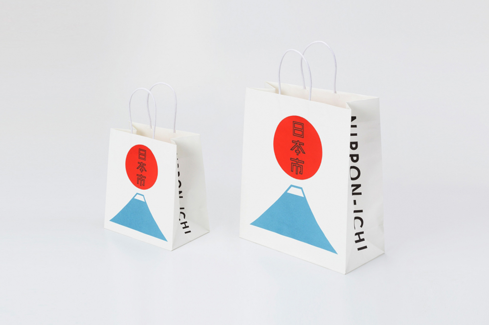
Another important piece of symbolism in Japan is that of the sun—after all, it’s on their flag! The sun is said to represent tradition and good fortune. For this reason, we see things like clouds, water and the sun appearing across Japanese graphic design. Logos are no different—this branding for Nippon-Ichi, a traditional crafts shop in Tokyo, designed by Good Design Company in 2010 features a hanging red sun over Mount Fuji. Mount Fuji is one of Japan’s Three Holy Mountains and has huge spiritual and cultural significance across the country. It’s often used as a symbol for Japan itself.
Next up, we’ll look at two very specific forms of symbolism that can be seen throughout the history of Japanese graphic design.
Geometry
Often Japanese graphic design will make strong use of geometric shapes. This is because geometric shapes are often imbued with cultural meaning in Japanese culture—they can be used to represent different, often abstract ideas. Squares and rectangles represent artificial forms and curves represent intuition and inspiration. Circles are particularly interesting. Known as Ensō in Japanese, they represent enlightenment, perfection, strength and elegance.
You’ll consequently find shapes and circles all over Japanese graphic design. If we take a look at the work of one of the most globally famous Japanese graphic designers, Ikko Tanaka, we can see a heavy use of geometric shapes—often using abstract geometric shapes to make up more recognisable forms. Tanaka’s work fuses Modernist concepts and aesthetics with Japanese traditions. Therefore, as well as his use of geometric shapes being in keeping with Modernist and Bauhaus conventions, there is a strong possibility that Tanaka also wanted to create a sense of what those shapes represent for Japanese people through his work.
On that note, it’s important to note that a lot of Japanese graphic design, both contemporary and historical, takes a lot from tradition, culture and folklore but this isn’t to say that it isn’t also strikingly modern and informed by how Japan was in the time it was created.
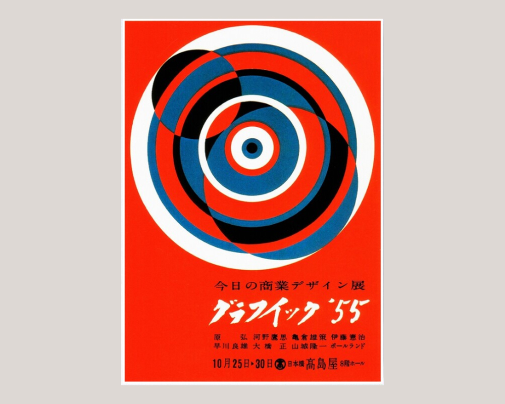
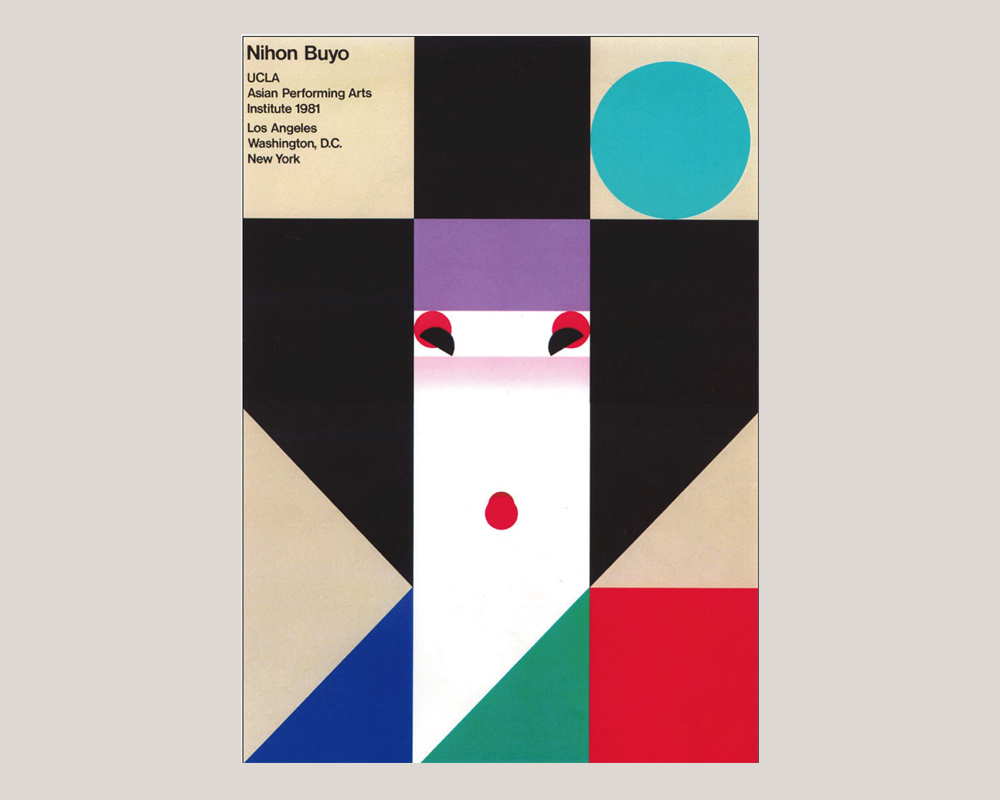
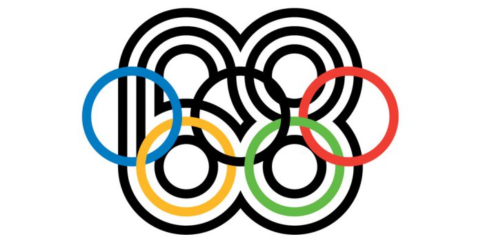
Geometric shapes—especially circles—also feature in a lot of work by another of Japan’s most famous graphic designers, Yasuku Kamekura. Famous for designing the posters for the 1964 Tokyo Olympics, Kamekura really mastered the use of circles in Japanese graphic design as we can see in this 1960s exhibition poster he designed.
Flowers
Patterns, both geometric and floral, can be found all over Japanese graphic design and art—and this has always been the case. Patterns are even prevalent in traditional Japanese fashion—Shibori is a traditional fabric dyeing technique that produces a number of patterns.
We’ve already touched on why geometry and the same applies for geometric patterns, but what about flowers? The reason that flowers and floral patterns have become a major part of Japanese graphic design is due to the art of Hanakotoba. Hanakotoba is the Japanese form of the language of flowers—in this language, each flower is imbued with an emotion or spiritual meaning. The Suikazura (honeysuckle) stands for generous, the Botan (peony) for bravery and, potentially the most famous of all the Japanese flowers, Sakura (cherry blossom) for kindness, gentleness and the transience of life.
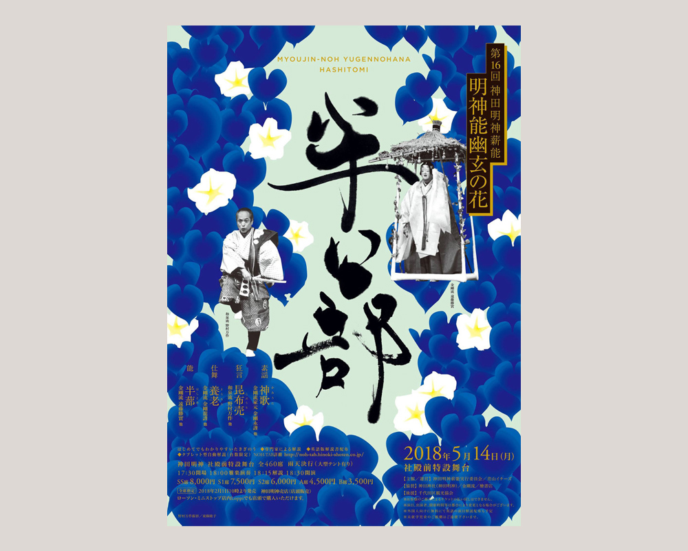
We can see flowers used in art director and graphic designer Chikako Oguma‘s 2018 poster for Hashitomi for a Noh, a traditional Japanese performance art. Though strikingly modern, Oguma’s poster uses the floral motif to recall tradition in his design. He aligns the traditional use of flowers in Japanese graphic design and art with the traditions of Noh, which has been performed since the 14th Century.
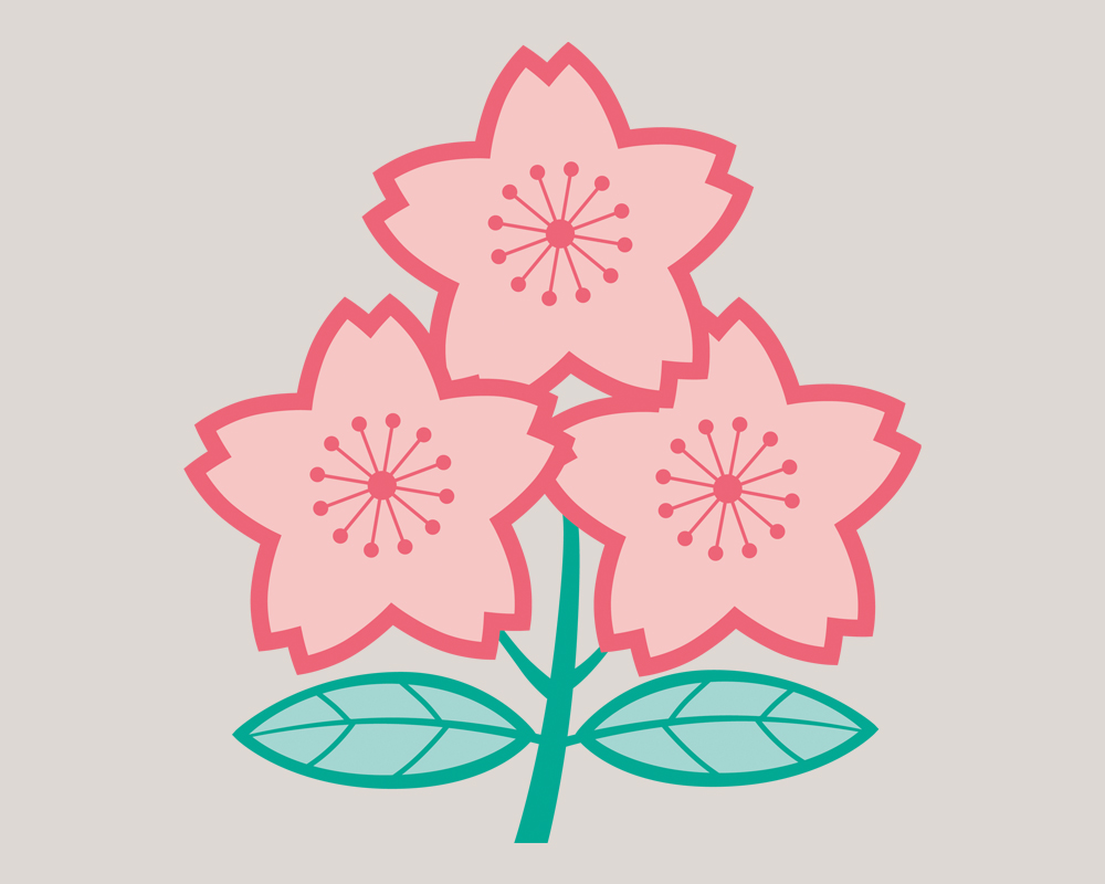
Interestingly, the Japanese national rugby team’s emblem also features three Sakura flowers which were designed by the so-called “Rugby Grandma” Ishi Fukui in her Kyoto sporting goods shop.
Of course, these are not the be all and end all of what Japanese graphic design has to offer. Like design from any country, the influences and inspirations behind Japanese graphic design are way more than one article could cover. We just wanted to give a taste of the unique culture and traditions that has inspired Japanese graphic design throughout history and today. We urge you to go out and do a deep dive into the world of Japanese graphic design—there’s so many amazing things to find!
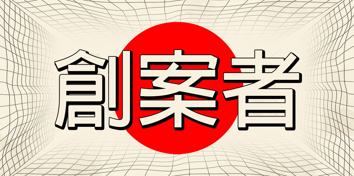
Header artwork by #ShilloMAN Teacher Lovish Saini. The Japanese word in the header is 創案者 (Sōan-sha) which roughly translates as originator or inventor but more succinctly be understood as someone who is the first to think of or make something.
Feeling inspired and want to become a graphic designer yourself? Study graphic design at Shillington and change careers in as little as three months online or on campus in New York, London, Manchester, Sydney, Melbourne and Brisbane.
Posts you might like

One of the best things about graphic design is that it never stands still for a moment. But that does mean that keeping up with...

The best graphic design books can take you on an exciting journey of the imagination, transport you to new creative worlds or...

At Shillington, our dedicated graphic design students are taught all about how to design for packaging—from FMCG (that’s fast...

At Shillington, our graphic design course teaches students how to design campaigns for a brand, helping to spread its message....

Exposing yourself to examples of good graphic design is a healthy practice no matter who you are. Maybe you’re a student...
At Shillington, our graphic design bootcamp students are taught how to design for digital, incorporating aspects of both UI and...
We love graphic design. And we're guessing, as you're here, you love graphic design too. This means that we all love graphic...

Graphic design is an ever expanding creative discipline. With our graphic design course, we teach you how to make research a...
Want to win some amazing prizes and stay in the loop with all things Shillington? Sign up to our newsletter to automatically go in the draw.