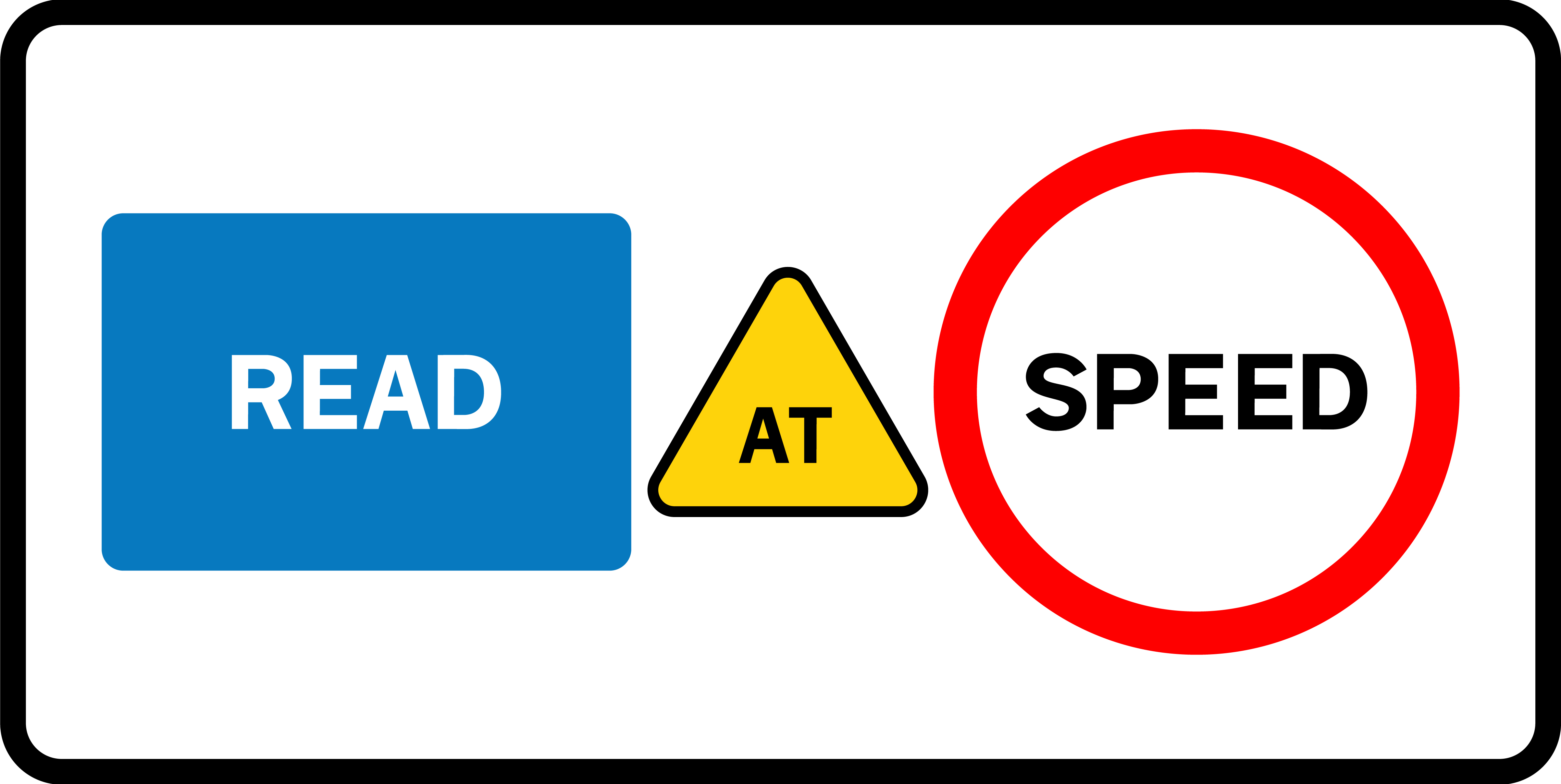
Read at Speed: The Work and Legacy of Margaret Calvert
It’s hard not to overstate the importance Margaret Calvert. Why? Can you name something you see everyday? How about road signs? They’re seemingly so mundane that it’s easy to forget that they’re one of the most used pieces of graphic design in the world—and designing them is an incredibly ambitious and radical project.
And, who designs these road signs? In the UK, the job was given to Margaret Calvert, a fresh graduate at the time who went on to become arguably one of history’s most important designers. Her work in the ’60s for the British government is one of the country’s biggest and most successful graphic design jobs ever—and has continued to influence designers ever since.
Planes, Trains and Automobiles
Calvert started off studying illustration at London’s Chelsea College of Art—and was actively dissuaded by her professor from learning typography. She excelled in her studies and constantly impressed her teachers. But, Calvert really wanted to be a designer so added commercial art to her studies. (In the 1950s, graphic design wasn’t something you could study). Luckily that professor left and was replaced by Jock Kinneir, who had worked for the influential Design Research Unit before opening his own practice in 1956.
Kinneir’s practice was hired in the 1960s to design the signage for the extension of London Gatwick Airport. He turned to one of his fresh graduates, Margaret Calvert, for assistance despite her never having actually designed anything before. Calvert’s first brush with information design, and indeed graphic design itself, was a huge success. It led to, after extensive research, the iconic black type on yellow directional and information signs used across the airport. Calvert’s signs are still used at Gatwick today and widely emulated at many other airports across the world—from Newark to Abu Dhabi. Kinneir quickly snapped Calvert up for a position at his firm.
Signs of the Times
Calvert became keen on lettering, working for British companies P&O Ferries and the now defunct Milk Marketing Board. Calvert then embarked on one of Britain’s biggest design jobs of all time. A bit of background: In 1957, the Anderson Committee was formed to review the signage for the country’s growing post-war motorway system. Then, six years later, the Worboys Committee did the same for all road signs across the country.
They decided every single road sign across the UK—from tiny country roads to the new M1 motorway—had to be redesigned. A radical job that would affect everybody across the country. Who got the job? You guessed it—Kinneir’s firm and a 27 year old Margaret Calvert. The signs had to be uniform, be easily readable from a car and be easy to read at speed.
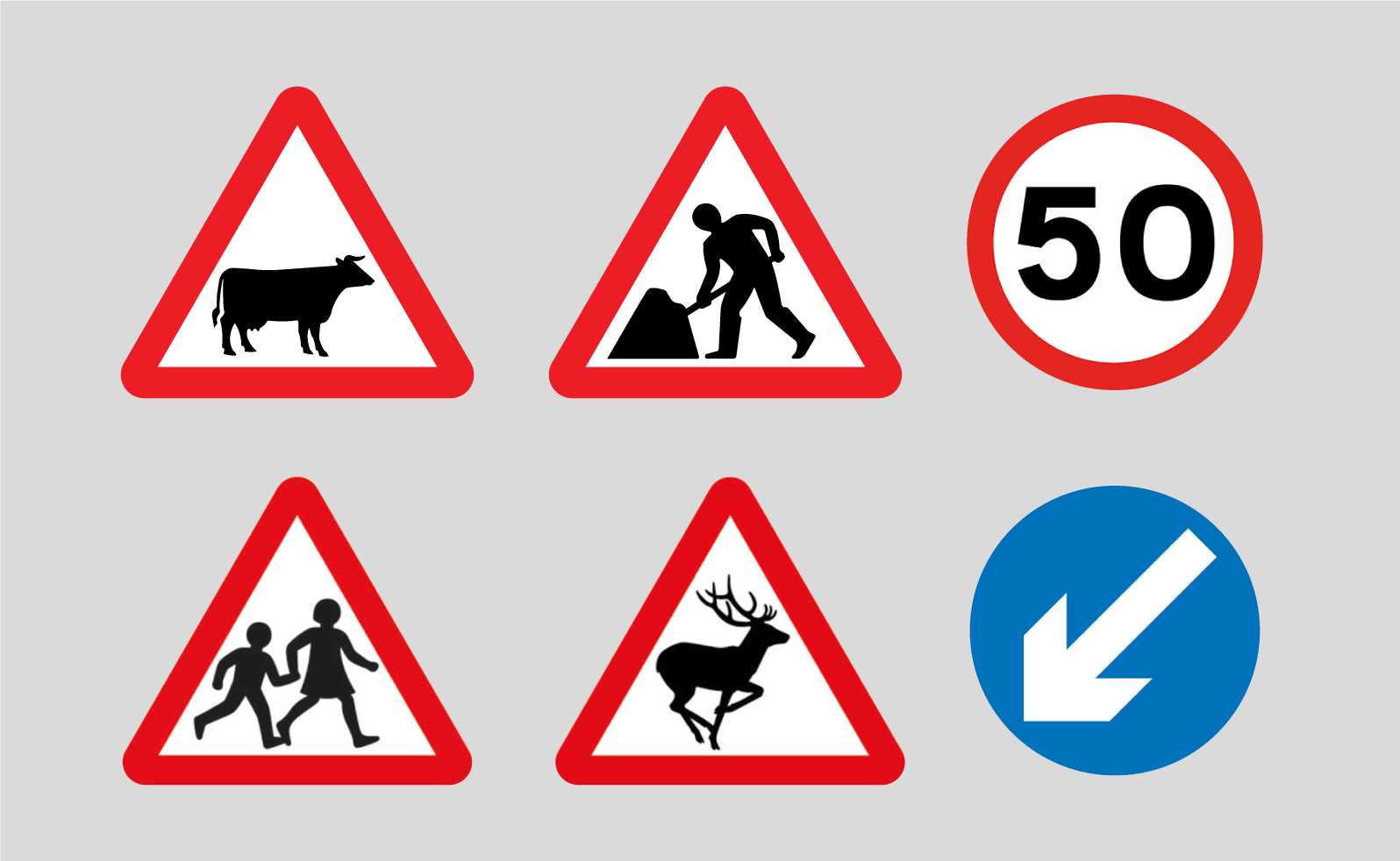
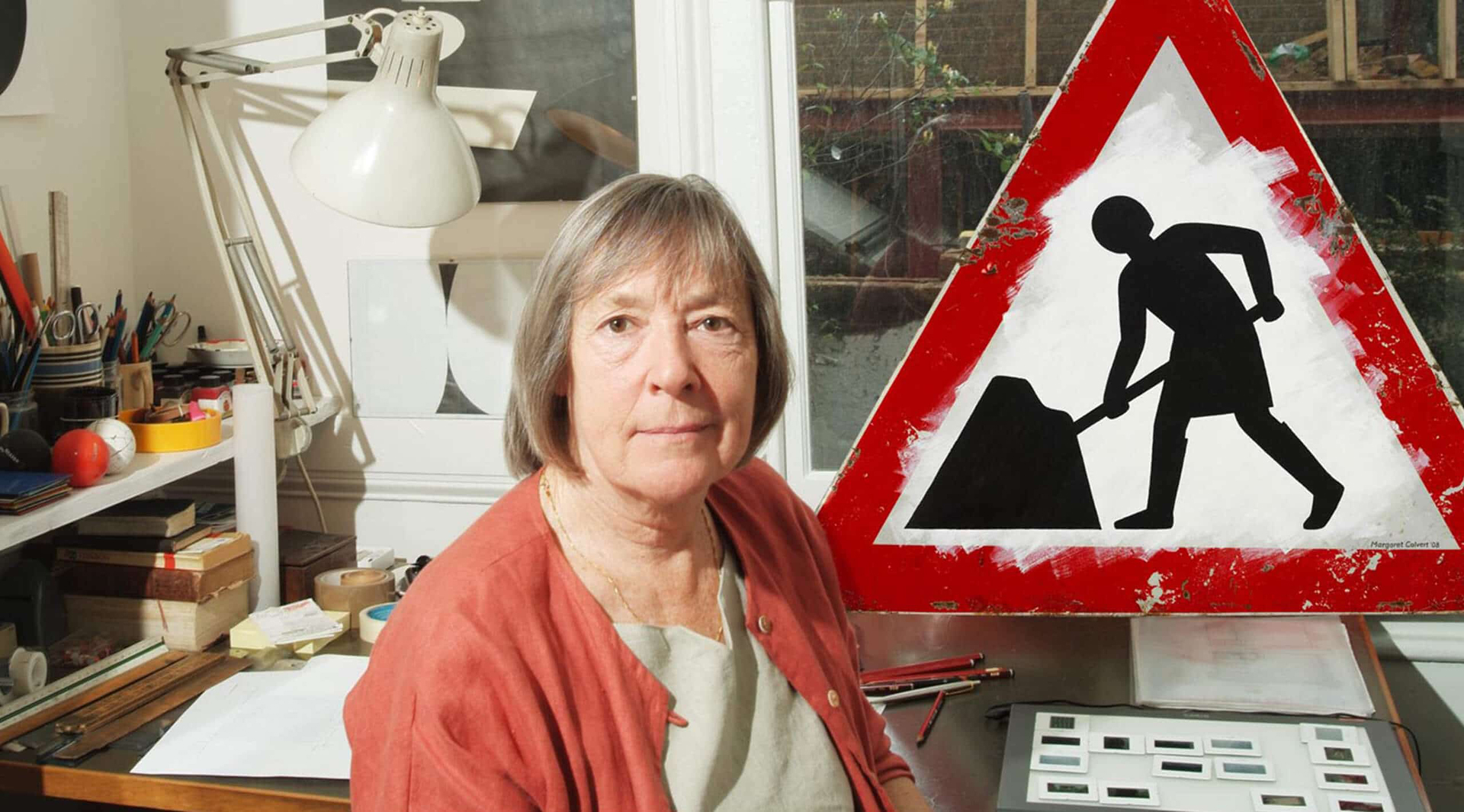
Kinneir’s firm at this point became Kinneir Calvert and Associates—as the two worked together to completely redevelop the systems of signs. Calvert designed three major elements for the new signs: pictograms and two typefaces. The job took five years in total. The pictograms had to be able to convey a message or warning without using words. So, effortlessly understandable symbols were key—this meant white on black, framed by a red border. And, there was a lot of them. Calvert designed signs for, but not limited to, trains, people at work, motorbikes, left turns, right turns, frogs, helicopters, falling rocks, tanks, old people and, of course, cows. Nice little add-on—Calvert’s cow is designed after Patience, her favourite cow growing up.
Motorway and Transport
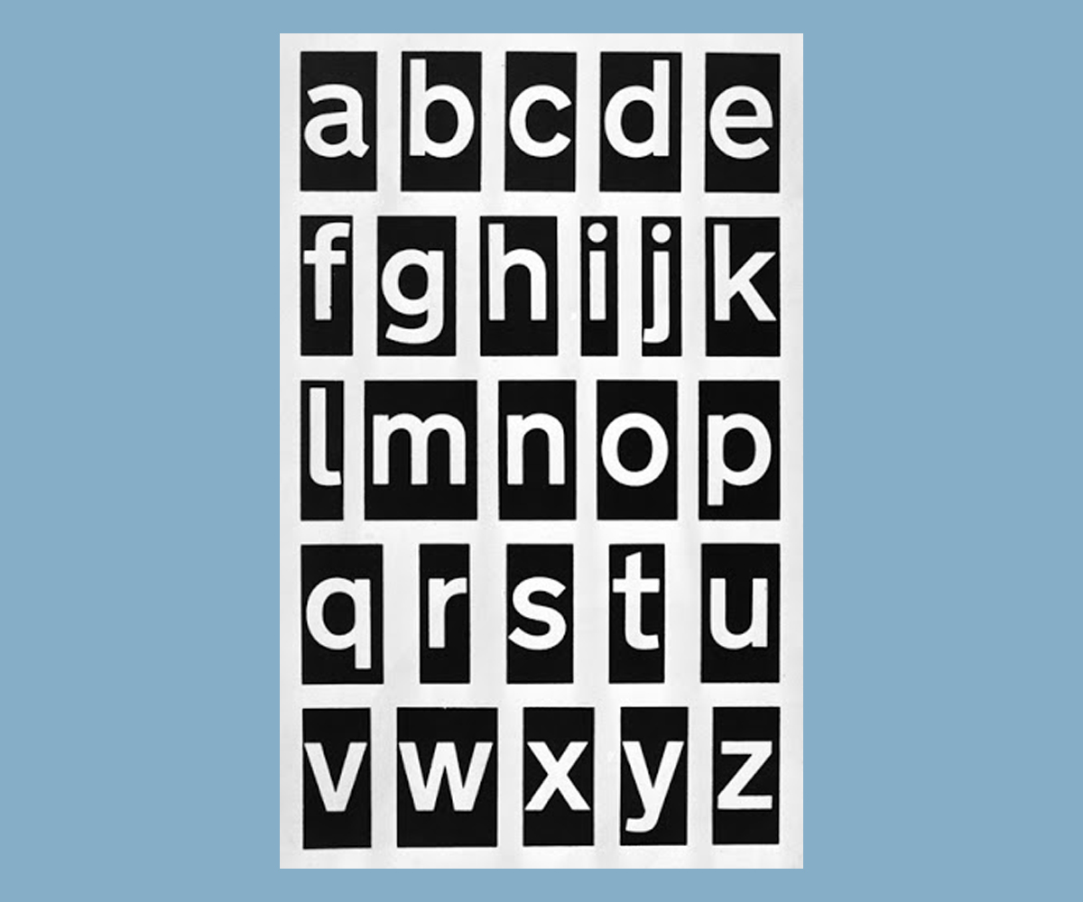
Calvert also designed two typefaces for the new road signage system—Motorway and Transport. Both of these were developed so that they could be easily read at speed and to eliminate confusion between characters. They were both designed completely from scratch by Calvert and Kinneir. Motorway, the first to be designed, comes in two weights—Permanent (standard weight) and Temporary (heavier). Both had a limited character set: the numbers 0-9, the capitalised letters M, A, B, N, E, S, W, a comma, an ampersand and ‘Toll’ (expressed as a single character).
Transport similarly has two different forms, Medium and Heavy. The latter is a boldfaced version of the former—used depending on the background colour of the sign. It contains both capital and lowercase letters, all numbers and a limited number of symbols. Calvert made the conscious decision to use both upper and lowercase letters in her signs to increase their legibility at speed. The shape of the words created when using both cases meant that words and names could be read whilst speeding past. Using all capital letters would have meant that drivers could only see length, not shape.
Calvert also created a new spacing system for her two typefaces. This system improved the appearance and readability of the typefaces to drivers. Important details, such as curves at the end of certain terminals, were added to Calvert’s characters to help further shape the words. All the decisions made during the design were focused on making a typeface that could be read at speed.
Margaret Calvert Conquering the World
Calvert faced criticism from Traditionalists, including complaints that the signs were too big. Though after rigorous legibility testing, Calvert’s road signage were incredibly successful. Her typefaces and pictograms remain in use on every road sign in the UK to this day. Transport has been adopted for road signs in countries around the world. To name a few, the road signs of Greece, Hong Kong, Ireland, Tanzania and Portugal use the typeface. Middle Eastern countries, including the UAE and Kuwait use the typeface for any latinised words on their signs. Denmark and Norway both use modified versions of the typeface, Vejtavleskrift and Trafikkalfabetet respectively. And, finally, James Montalbano’s Clearview Highway, a typeface used on road signs in around 30 US states, was heavily influenced by Calvert’s Transport.
Margaret Calvert’s designs have become so ubiquitous, not only across the UK but on a global scale, that its easy to glaze over just how ambitious and influential the project was and remains to be. It was a redesign for every road sign across the UK, all British Overseas Territories, and some Commonwealth states. Calvert, who had only been out of college for a few years, designed a typeface and pictograms that were going to appear on literally thousands of signs.
Defining a Country
Margaret Calvert and her designs defined a country’s travel network, especially if you consider she also designed the Rail Alphabet which was used across British Rail and Sealink’s, the former British ferry company, entire network). She made her very literal mark on information design the world over.
On top of this, less than half a century after Women’s suffrage in the UK, Margaret Calvert was designing one of the biggest graphic design projects in the world at the time. She was working at the forefront of an industry that was male-dominated and, in some respects, continues to be. Calvert was a trailblazer, as both an information designer and a female designer and this should never be understated.
Originally published in Shillington Post 08—The Creative Women Issue.
For more insights from Shillington staff, graduates and guest authors, check out all issues of the Shillington Post over on Issuu.
Posts you might like

One of the best things about graphic design is that it never stands still for a moment. But that does mean that keeping up with...

The best graphic design books can take you on an exciting journey of the imagination, transport you to new creative worlds or...

At Shillington, our dedicated graphic design students are taught all about how to design for packaging—from FMCG (that’s fast...

At Shillington, our graphic design course teaches students how to design campaigns for a brand, helping to spread its message....

Exposing yourself to examples of good graphic design is a healthy practice no matter who you are. Maybe you’re a student...
At Shillington, our graphic design bootcamp students are taught how to design for digital, incorporating aspects of both UI and...
We love graphic design. And we're guessing, as you're here, you love graphic design too. This means that we all love graphic...
In graphic design, quite a few decisions happen behind the scenes that clients may not grasp the importance of, yet have a huge...
Want to win some amazing prizes and stay in the loop with all things Shillington? Sign up to our newsletter to automatically go in the draw.