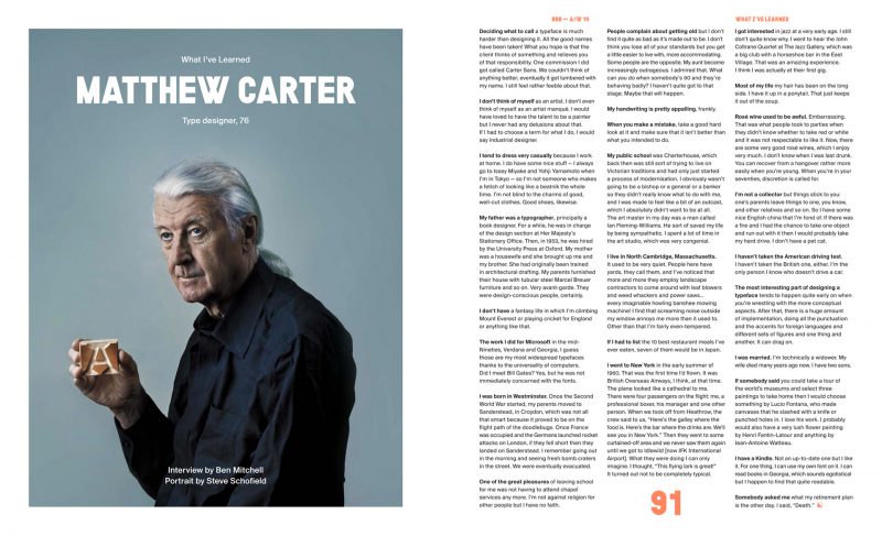
Matthew Carter: Famous British Type Designer
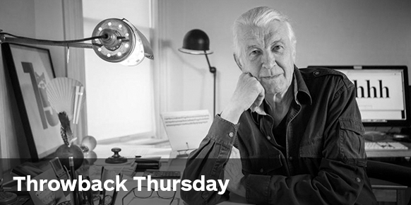 Matthew Carter (b. 1937)
Matthew Carter is arguably the world’s most widely read designer. If you don’t recognise his name—you’ll recognise his work, and have probably come across it in your day-to-day without ever realising …
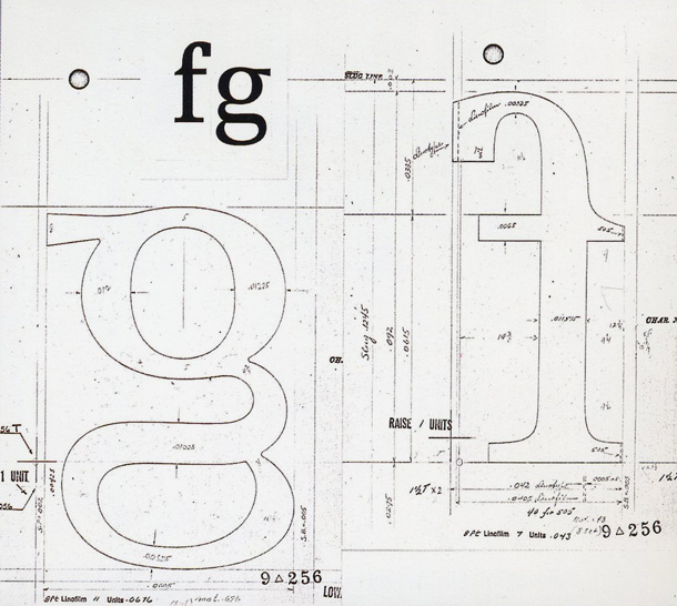
Starting his career as a punch cutter apprentice at 19, Matthew Carter has been in the business of type for over six decades. He is one of the few typographers that have bridged all three major technologies used in type design: physical typesetting (wood and metal), phototypesetting and digital font design.
“I love getting commissions for things that I have never done before. I always look forward to being challenged in that way.”
The introduction of new technology, and desire to solve technical problems through type has always fuelled Carter’s passion. The first major shift started in 1960, when the typesetting trade in London was conservative and it was impossible to find Helvetica anywhere. Moving away from a more traditional style, the 1960’s saw a growing demand for designers that could draw lettering in the contemporary style. “Type design had been seen as a brave but arcane business that requires a lifetime’s dedication. I’m happy that notion is gone.”
Carter started a business designing lettering which at the time involved hand-drawing the letters, copying them photographically, and then pasting up the words.
Among his clients was Colin Forbes (who designed D&AD‘s logo in 1963 and later became Pentagram)—who commissioned him to create a Greek sans serif font for his client Cyprus Airways. It wasn’t until Carter took a trip to New York in the mid 1960’s, and visited the studios of Herb Lubalin and Milton Glaser, that really opened up his eyes to contemporary design.
“People use the term “culture shock” very glibly nowadays, but this was a real shock to me. I had grown up in a sort of typographically privileged world in England and I was very cocky. I thought I knew everyone and everything. In a matter of days I realized I was completely ignorant. … I saw type-based work that I had no idea about. To be honest, it scared me. … ”—Matthew Carter.
This trip was a pivotal moment in his career, and prompted him to move to New York and begin working in-house at Linotype.
When Carter started Georgia and Verdana for Microsoft in the 1996, most examples in use at the time were either adapted from print, or created primarily with user interface in mind. Screen resolution wasn’t what it is today, so Carter’s challenge was to create a font that would print handsomely, but also have monitor legibility. This was a time when everything was about bitmaps—every pixel was on or off.
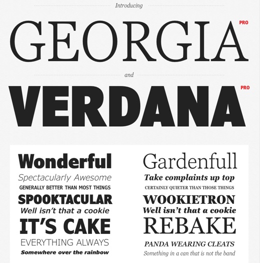
In 2005 when Carter was profiled in the New Yorker, he began to receive recognition in a previously under-appreciated craft. Sometimes the spotlight worked against him, mostly to his amusement—as he puts it, for fifteen years he was the most hated man in design. Web designers hated him because Georgia and Verdana were among the few fonts they could use. Carter had anticipated a flood of specially designed web fonts to compete with his designs, which were the product of an earlier technological generation and was more surprised than anyone that Georgia and Verdana have become so engrained in the internet’s visual culture.
Off screen, Georgia and Verdana have also made appearances in print. In 2010 there was a lot of “fontroversy” when it was announced that IKEA would be changing from Futura to Verdana.
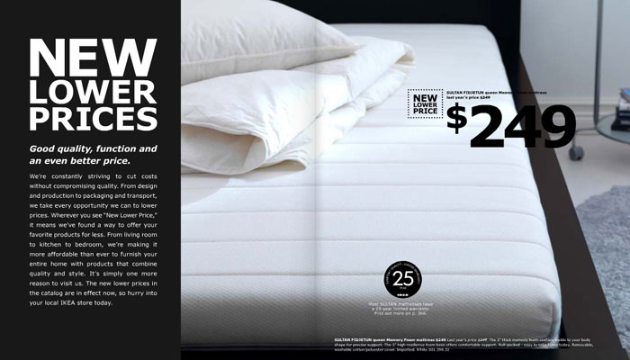
It was something Carter had no involvement, or idea about, until people started confronting him at conferences—“I give a talk about something historical and then at the end someone will get up and say: “I started a petition to go back to Futura. You’re a villain!””.

The reason for the change as put by IKEA spokeswoman Camilla Meiby, “ … Verdana is a simple, cost-effective font which works well in all media and languages”. This decision was not just brought on by the demands of the digital age, but also an important question—how do you design without sacrificing legibility?
“Typography is a beautiful group of letters, not a group of beautiful letters”.
You can probably begin to understand why Esquire featured him in Issue Four of The Big Black Book—a biannual style edition for successful men.
Carter’s reputation is one built on both good type and good words. The recipient of too many awards to name, his experience and achievements in typographic technology bear him much wisdom. An articulate commentator on typography and an amused observer of its public life—J. Abbott Milller, partner at Pentagram—captures Carter perfectly:
” … When he states that “technology changes faster than design,” he is arguing, gently, for the preservation of typographic ideals; when he says he is “not an absolutist,” he is advocating tolerance of the experimentation of younger type designers. …”
For each successive technological revolution in type, Carter has always been among the first to create popularly used faces. He has designed type for Time, Newsweek, Sports Illustrated, Wired, and the Guardian. He’s also worked on projects for Le Monde, Yale University, and The New York Times—who remain a good client of his. “Someone asked me what my retirement plan is the other day. I said, “Death”.”
Matthew Carter’s work plays such a polarising role in design. Learn more about the man behind the screen in his TED Talk: ‘My life in typefaces’. Find out how he breaks tradition in his process, and what’s involved in designing a font in his interview with Play Gallery. You can also read more about the Futura v. Verdana “fontroversy” in The New York Times article ‘Typography Fans Say Ikea Should Stick to Furniture’.
Posts you might like
In graphic design, quite a few decisions happen behind the scenes that clients may not grasp the importance of, yet have a huge...
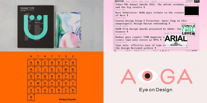
It’s that time of year again! As the new year approaches, it’s become somewhat of a tradition for us to look back at our...
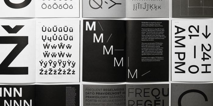
We all know that sometimes finding the perfect typography for a design project can be like finding a needle in a...
Dipped your toes into the world of graphic design? You'll know that typography is something that underpins almost every aspect...
Considering how much the world has changed since this time last year, making general predictions for what the next 12 months have...
Whether you’re a student or a recent graduate, living on a tight budget means looking for savings wherever you can, including...
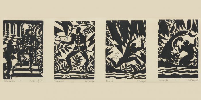
Aaron Douglas was a leading artist of the Harlem Renaissance, also known as the New Negro Movement. Douglas, along with the...

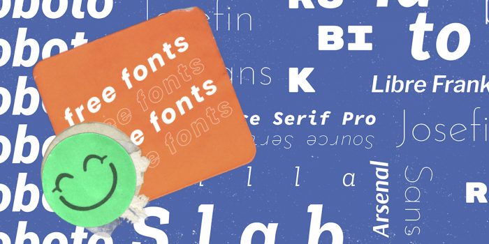
You need some typography for your project and you're on a tight budget. You'd love that stunning sans serif or stylish...
Want to win some amazing prizes and stay in the loop with all things Shillington? Sign up to our newsletter to automatically go in the draw.