15 Graphic Design Campaigns Designed & Created by Shillington Education Students
Out of the over thirty briefs that Shillington students complete on the course, the Campaign Brief is one of the biggest—both in terms of deliverables and length of deadline. Though it’s also one of the funnest. Students are given a free rein and can choose their own topic they want their campaign to cover. This means that the campaigns can be really close to their heart, producing some truly wonderful results.
We looked back over the last year of incredible student portfolios and picked out some of our favourites to share with you from our campuses across the world.
1. Successfully Slow by Jessica Mosoph
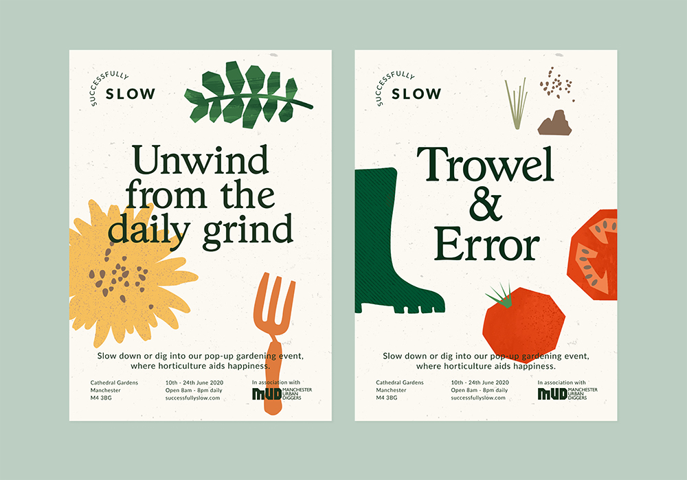
Jessica Mosoph’s Successfully Slow campaign is for a pop-up gardening event based in a city centre. It aims to get a busy, city-dwelling audience to consider a holistic approach to mental health and up some gardening tools to encourage happiness. If that doesn’t bring a smile to your face, then her abstracted shapes and down-to-earth (if you’ll pardon the pun) copy surely will.
2. Tamil Feasts by Darsh Seneviratne
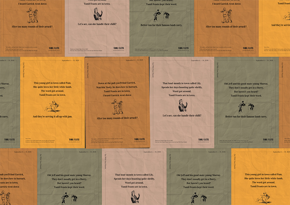
Darsh Seneviratne’s campaign was for Melbourne-based social enterprise Tamil Feasts. Advertising Eat With Your Hands!, a food tour that travelled throughout Australia to share stories from asylum seekers and encourage positive perceptions of different cultures, the campaign uses a tongue-in-cheek tone of voice and copy that is relatable to the everyday Australian. Bridging the gap between Sri Lankan and Australian culture, the campaign aims to create real change through a charming design.
3. A24 Anywhere by Kevin Lapsley
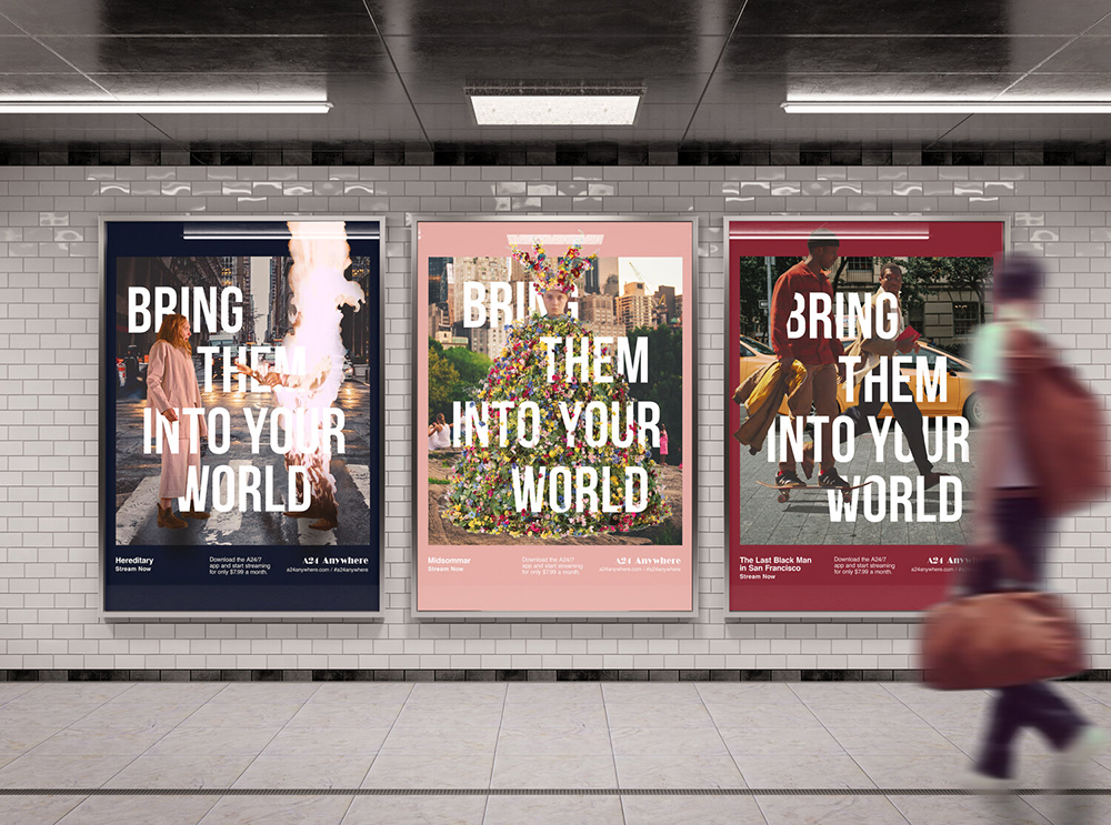
A24 Anywhere is a campaign by Shillington graduate Kevin Lapsley to help spread the word about independent movie company A24’s new exclusive app. Kevin’s intelligent campaign takes some of the most recognisable characters from recent A24 films—The Lighthouse, Midsommar and The Last Black Man in San Francisco—and places them in real life scenarios, where you are likely to see the posters.
4. Grand Tales by Georgia Latham
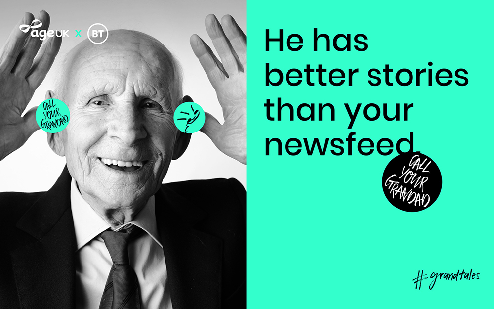
Georgia Latham’s Grand Tales campaign came from a place of guilt. Guilt that she didn’t speak to her grandparents enough. So her campaign, which teamed up BT and the charity Age UK, encourages young people to make sure they call their grandparents. Her tone of voice is used particularly cleverly—it appeals to the millennial mindset whilst making sure that calling their relatives seem appealing. An especially poignant campaign in the current state of the world!
5. Altrincham by Ella Dawson
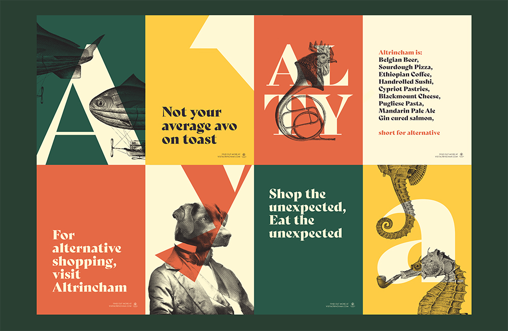
Breathing life into a former “ghost town”, Ella Dawson’s campaign for the town of Altrincham and its many independent shops, bars and restaurants is truly gorgeous. The campaign uses the unexpected, seahorses smoking pipes being just one example, to emphasis the suburb’s alternative nature. Quirkiness is key to this campaign, which also wittily uses the word ‘Alty’—short for both Altrincham and alternative.
6. Un Dos Trés by Natalia Vilela
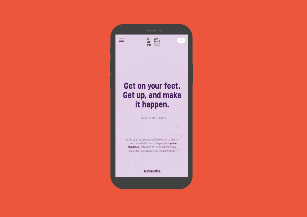
Un Dos Trés came to Natalia Vilela’s mind when many people across the world were instructed to Stay Home during the 2020 Coronavirus pandemic. The Youtube-fronted campaign invited people to a virtual, global dance party which celebrated some of the most respected and idolised female performers in Latin American music. The incredible musicians Gloria Estefan, Selena Quintanilla and Celia Cruz are immortalised in Natalia’s colourful, vibrant illustrations.
7. Your Backyard’s Better by Jedd Perez
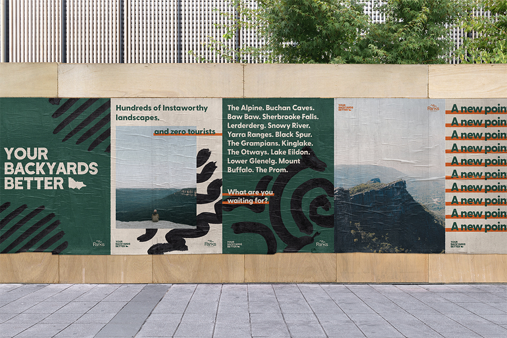
When the Coronavirus pandemic bought a stop to global travel, Jedd Perez wanted to create a campaign that showed that you didn’t need to travel the world for amazing experiences. Your Backyard’s Better was a campaign for Parks Victoria which uses a strong confident tone of voice, an inviting, natural colour palette and a bold, sans serif typeface to effectively urge people to stay and experience their home state.
8. YOU GOT THIS by Kaja Kusak
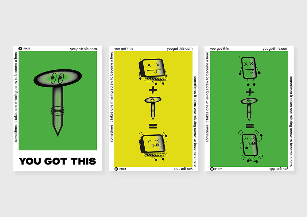
“Don’t buy, fix it!” was the main point of inspiration behind Kaja Kusak’s YOU GOT THIS campaign. Moving copy in to the background, the campaign focuses on some adorable monochrome illustrations to get its point across—that you can fix things yourself and don’t need someone to do it for you. We’re also suckers for a good sticker and we want to plaster everything we own in Kaja’s characters.
9. Girls Who Code by Eva van der Borght
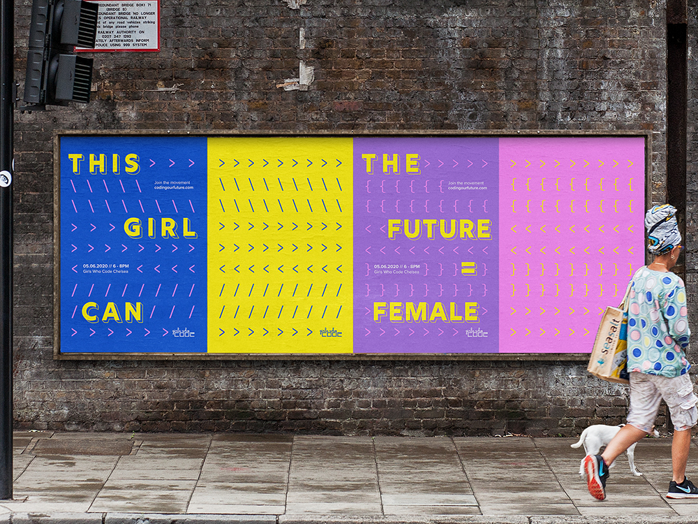
Coding doesn’t always come across as the most alluring skill—especially to women—but Eva van der Borght’s campaign aims to change that. The real beauty behind Eva’s posters is their simplicity. She takes typical symbols and elements associated with coding, bright attractive colours and a bold display font to flip notions of coding being a boring, cold industry on its head. The future for coding definitely seems bright through Eva’s brilliant work.
10. 100% Real by Mina Tung
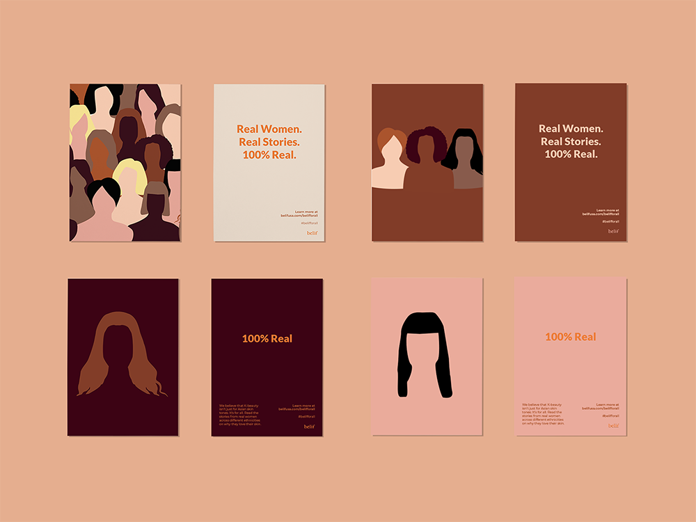
Mina Tung’s 100% Real campaign aims to promote diversity and empower to people to love the skin they are in. Using simple, pared-back illustrations which utilise real, beautiful skin tones that really bring Mina’s messaging to life. Mina also employs a truly empathetic tone of voice to back this up. Phrases such as ‘You’re beautiful’ and ‘Diversity is beautiful’ appear across the poster series so that each and every women who sees them knows that this campaign is about them.
11. Men Like Flowers Too by Alexandra Zimbicki
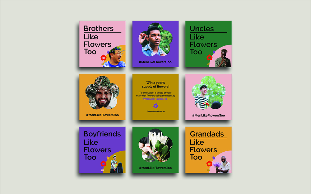
Men Like Flowers Too is a heartwarming campaign by Shillington graduate Alexandra Zimbicki. The campaign aims to change perceptions about who enjoys receiving flowers to encourage more of the population to buy flowers for their loved ones—no matter their gender. Using colours that would traditionally be considered as feminine combined with simple floral icons, Alexandra’s campaign invites anyone to go out and buy followers. Whilst also flipping outdated gender notions on their head.
12. Decode by Sofia Jofre
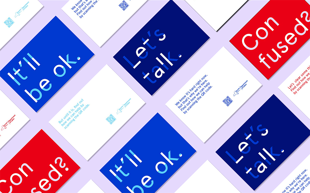
Created for New York State’s Department of Labour, Decode by Sofia Jofre aims to give a friendlier tone to some often upsetting topics. Namely, unemployment, benefits and other things that can have a huge impact on somebody’s life. Using inviting typographic posters, Sofia’s campaign gives the Department a whole new feel—friendly and approachable. Her fantastic tone of voice such as ‘We’re here for you’ makes the uncomfortable much more approachable.
13. Running is a State of Mind by Elana Solomon
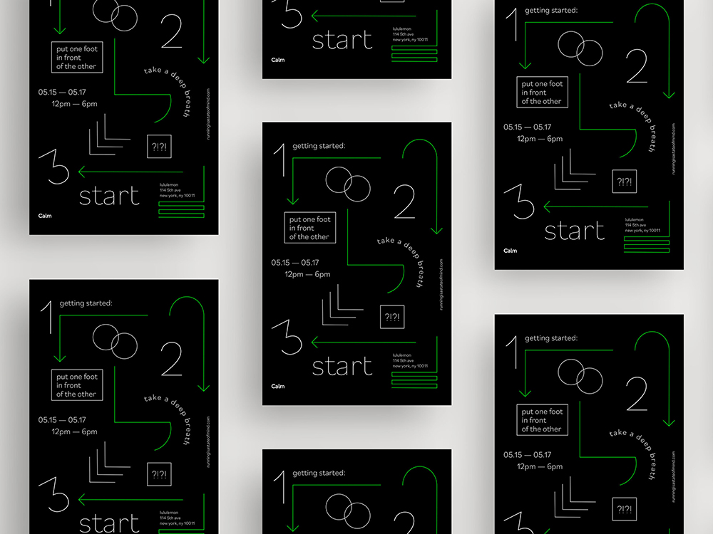
A collaboration between mindfulness app Calm and athletics company Lululemon, Elana Solomon’s campaign uses geometric shapes and mono-weight typography to produce something truly amazing. Aimed to emphasise the benefits and importance of running on mental health, the posters are inspired by user guides and manuals. They therefore implement a straightforward and direct tone of voice. All this together creates an effective, engaging campaign that doesn’t beat around the bush.
14. Rescue Romance by Marc Morrell
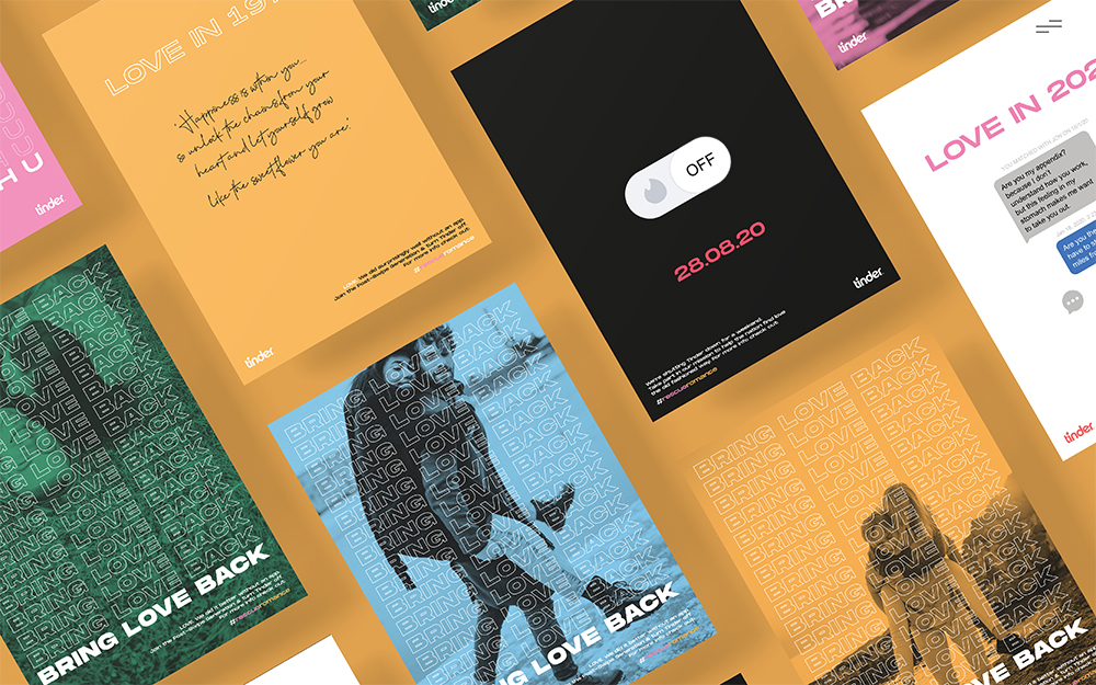
Rescue Romance is Marc Morrell’s answer to people’s dependence on dating apps. The campaign, which has teamed up with Tinder, encourages people to step out from behind the app and go out and meet people in real life (or perhaps we should say IRL). Using trendy stacked text, what can only be described as a cheeky tone of voice and young people’s favourite form of communication, emojis, Marc creates a campaign that truly hits its target audience.
15. Girls Rock by Kat Ramirez
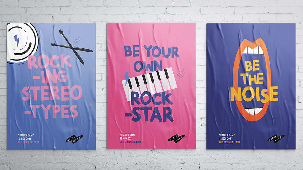
Girls Rock by Kat Ramirez is a campaign to help promote inclusivity and self-expression amongst female, transgender and non-binary youth. It aims to get these groups to express themselves through music and the community that surrounds it by throwing the outdated sentiment of rock music being a boys’ club out the window. A fun tone of voice, complementary colour palette and some electrifying illustrations make this a super successful campaign.
Want to create amazing work like this? Shillington’s innovative graphic design course would be perfect for you. Study in person—in London, Manchester, New York, Sydney, Brisbane or Melbourne—or Online and become a graphic designer in three months full-time or nine months part-time.
Posts you might like

One of the best things about graphic design is that it never stands still for a moment. But that does mean that keeping up with...

The best graphic design books can take you on an exciting journey of the imagination, transport you to new creative worlds or...

At Shillington, our dedicated graphic design students are taught all about how to design for packaging—from FMCG (that’s fast...

At Shillington, our graphic design course teaches students how to design campaigns for a brand, helping to spread its message....
Exposing yourself to examples of good graphic design is a healthy practice no matter who you are. Maybe you’re a student...
At Shillington, our graphic design bootcamp students are taught how to design for digital, incorporating aspects of both UI and...
We love graphic design. And we're guessing, as you're here, you love graphic design too. This means that we all love graphic...
In graphic design, quite a few decisions happen behind the scenes that clients may not grasp the importance of, yet have a huge...
Want to win some amazing prizes and stay in the loop with all things Shillington? Sign up to our newsletter to automatically go in the draw.