Wim Crouwel: A Dutch Graphic Designer, Type Designer & Typographer
Wim Crouwel (b. 1928)
Wim Crouwel is an iconic Dutch graphic designer and typographer. His career spans six decades, following an extraordinary journey from designer to teacher to curator to museum director.
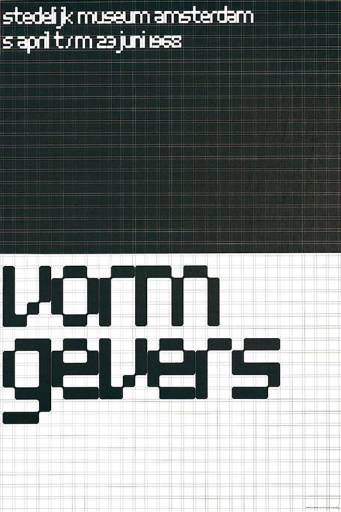
After studying design and typography, Crouwel co-founded the studio Total Design—now called Total Identity—in 1963. In this role, he also started a most significant and long-lasting working relationship with Stedelijk Museum in Amsterdam. He designed a plethora of posters for various exhibitions at the museum throughout the 50s and into the 60s.
Crouwel’s design work is firmly based in a systematic approach and it’s clearly influenced by a modernist notion of Functionalism.
One of my favourite Crouwel projects is his Hiroshima poster. It’s a great example of how a strong emotion can be communicated through just type and colour. The bold condensed type on the red background makes it feel terrifying.
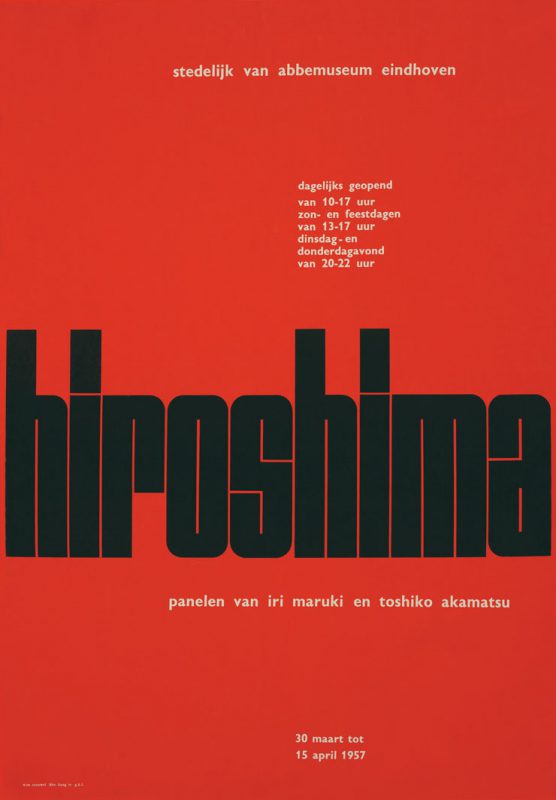
This poster was designed in 1957, yet wouldn’t feel out of place on the streets today. Modernism is timeless.
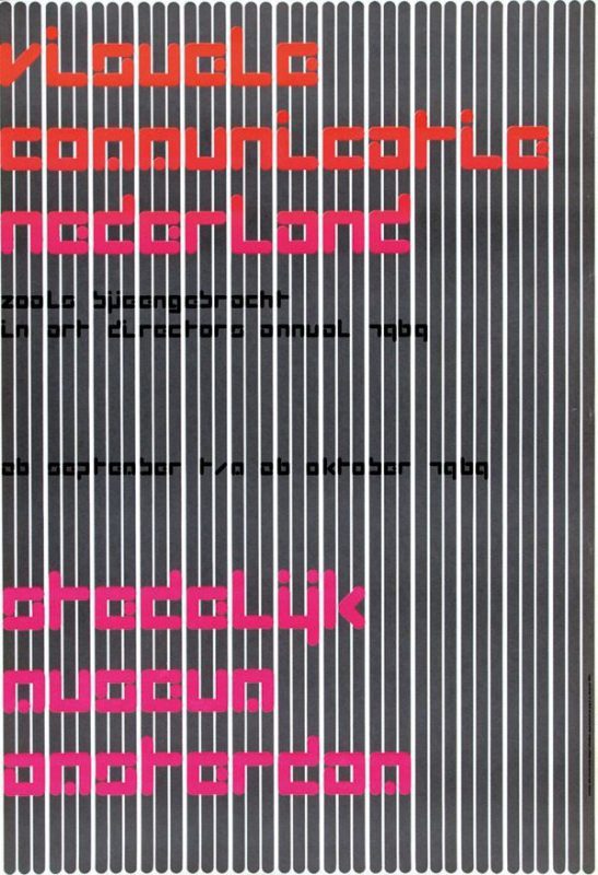
Another example of Crouwel’s progressive and experimental nature comes through his bespoke typeface on his Visual Communication poster. What I love about this poster is the fact that it’s for an exhibition on Visual Communication, yet he has purposely made it very difficult to read, with the barcode like stripes and use of the strange experimental typeface.
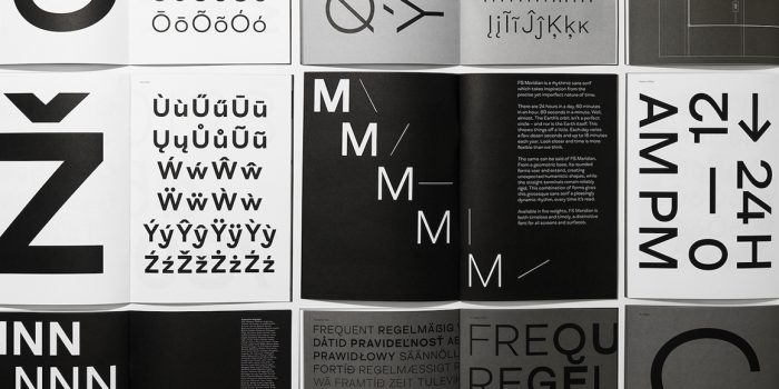
In 1967, Wim designed an experimental typeface embracing the limitations of early data display screens in his New Alphabet. Because of the inability to display curves well, the typeface only contains horizontal and vertical strokes.
Wim liked to push the boundaries of language and letterforms.
You’ll notice that the M and the N for example are identical apart from an underline indicating which letter is the M is.
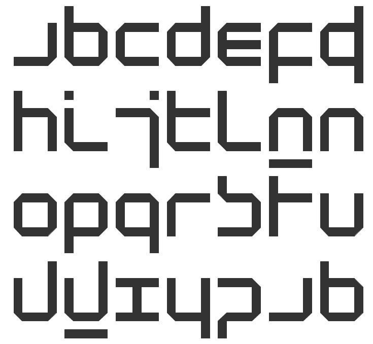
So you can see how he injects a bit of humour to a modernist aesthetic.
I admire Crouwel’s work because it’s based on strict modernist principles. He relies on strong use of grids and an appreciation for the ‘less is more’ philosophy. Yet, although logic and clarity play a huge part in his design aesthetic, he also injects his own personality with the use of experimental typography—turning what could be considered quite cold, modernist design into something with more attitude.
Want to learn more about Wim Crouwel? Watch this video!
Or keen to use a Crouwel font? Download Fodor or Gridnik from The Foundry.
Posts you might like
In graphic design, quite a few decisions happen behind the scenes that clients may not grasp the importance of, yet have a huge...
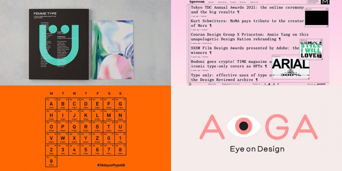
It’s that time of year again! As the new year approaches, it’s become somewhat of a tradition for us to look back at our...
We all know that sometimes finding the perfect typography for a design project can be like finding a needle in a...
Dipped your toes into the world of graphic design? You'll know that typography is something that underpins almost every aspect...
Considering how much the world has changed since this time last year, making general predictions for what the next 12 months have...
Whether you’re a student or a recent graduate, living on a tight budget means looking for savings wherever you can, including...
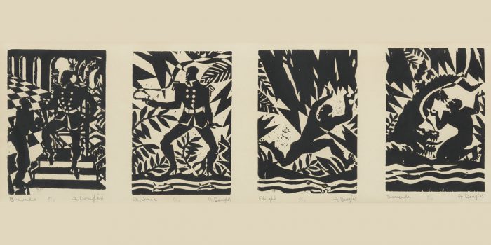
Aaron Douglas was a leading artist of the Harlem Renaissance, also known as the New Negro Movement. Douglas, along with the...

You need some typography for your project and you're on a tight budget. You'd love that stunning sans serif or stylish...
Want to win some amazing prizes and stay in the loop with all things Shillington? Sign up to our newsletter to automatically go in the draw.