Shillington Winners of the 2020 Indigo Awards
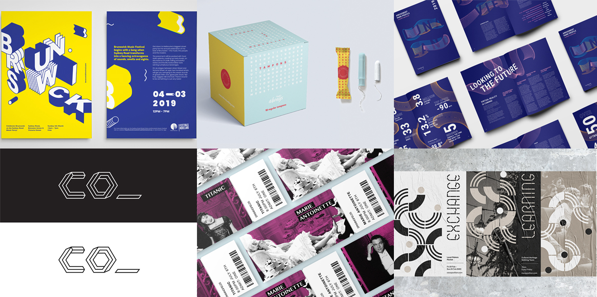
The Indigo Design Awards started with the goal of promoting creativity and discovering projects from around the world that are unique and inspired in graphic design, digital, mobile and game design. This year, 8 Shillington graduates and 4 teachers got awards for their projects! Read on to find out about the winning projects from Kelly O’Connell, Carolyn Hawkins, Vanessa Castiglione, Anna Dai, Chantelle Lam, Suzannah James, Malik and Mack (Sarah Malik and Cali Mackrill), Alan Barba, Shanti Sparrow, Anthony Wood and Jimmy Muldoon.
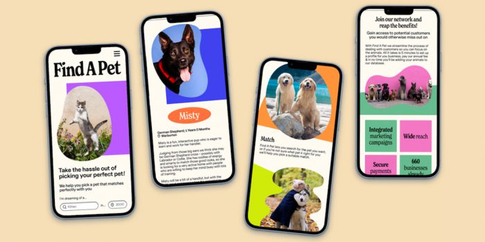
Kelly O’Connell, Shillington Graduate
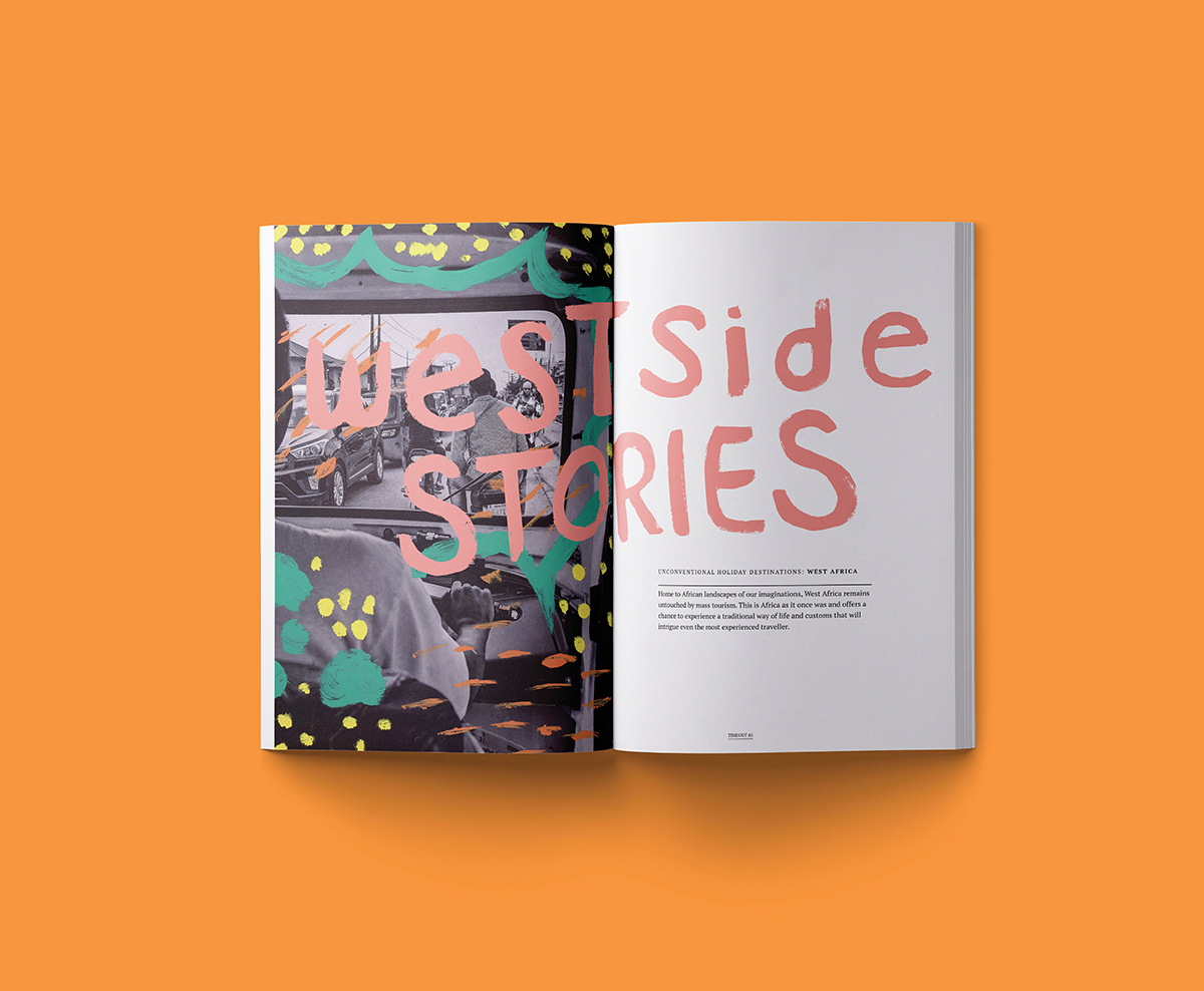
Rogue Magazine, Silver in Magazine & Newspaper Design 2020, Non-Pro Award
“Rogue Magazine is a divergent travel magazine that highlights unconventional travel destinations. I was tasked with creating the typesetting and imagery for a four-page spread as well as the magazine cover. I chose to use some handmade elements to highlight the art scene in West Africa.”
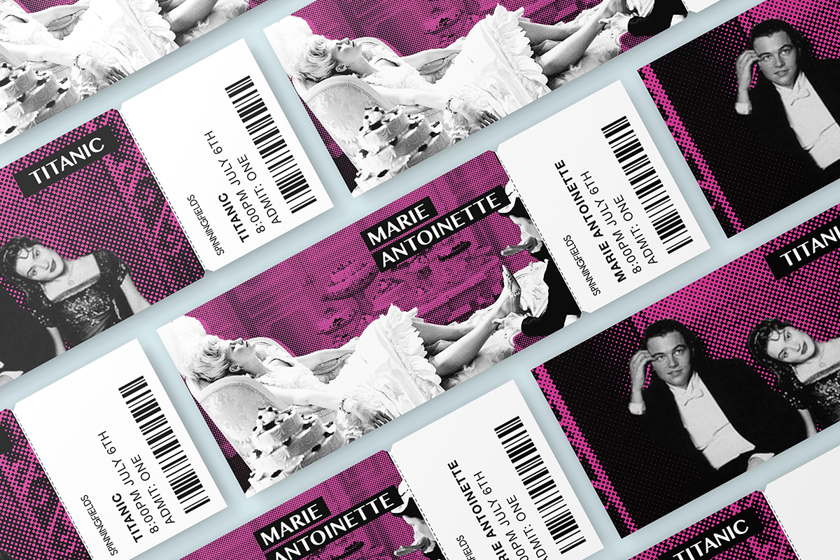
Spiningfields Movie Festival, Gold in Promotional Materials 2020, Non-Pro Award
“This was a typesetting project I worked on at school. We were tasked with creating a brochure for the Spinningfield’s film festival and then I revisited the project for portfolios rolling out an entire event identity.”
Carolyn Hawkins, Shillington Graduate

Cô Cò Pavilion, Gold in Branding 2020, Non-Pro Award
“The concept of Cô Cò Pavilion’s brand identity draws on the city’s rich heritage, incorporating shapes drawn from traditional Vietnamese patterns and a recurring wave motif signifying the fluidity of water and exchange. These elements form the basis of a dynamic modular system used throughout the identity rollout, including promotional materials, merchandise, a suite of icons, wayfinding, and a custom typeface.”
Vanessa Castiglione, Shillington Graduate
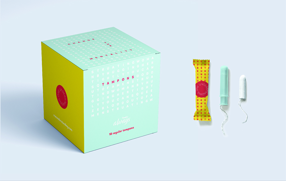
One Understanding, Gold in Branding 2020, Non-Pro, Gold in Branding for Social Change 2020, Non-Pro Silver in Packaging Design for Social Change 2020, Non-Pro Awards
“One Understanding, a period education campaign, brings to light the widespread misunderstanding of periods. Periods, as an important element of reproduction, affect us all. One Understanding, through a fun, lighthearted visual identity system, educates the public with facts and definitions on menstruation. The campaign also fights period myths that exist, with the word search type visuals that spell out myths that exist in society today. It is time to achieve one understanding of periods and destigmatize the conversation.”
Anna Dai, Shillington Graduate
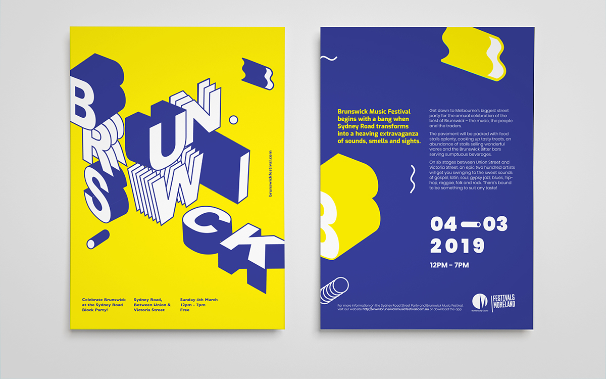
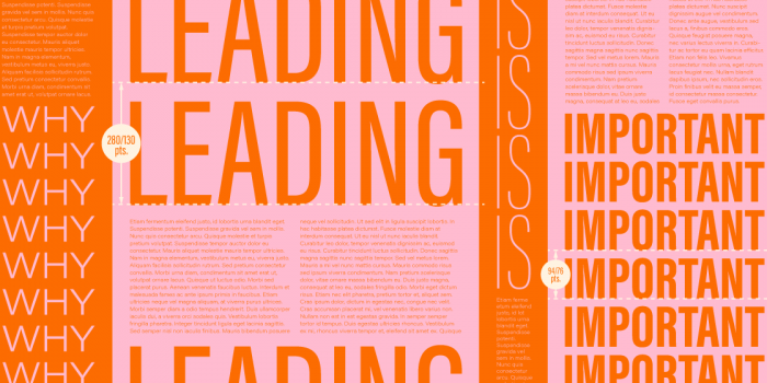
Brunswick Block Party, Gold in Typography 2020, Non-Pro Silver in Branding 2020, Non-Pro Bronze in Promotional Materials 2020, Non-Pro Awards
“The Brunswick Block Party is Melbourne’s biggest street party, transforming Sydney Road into a heaving extravaganza of sounds, smells and sights for one huge day of festivities. With resident DJs spinning all day, live graffiti and a free-for-all skatepark, it’s a day to celebrate and commemorate the rebirth of this Northside city with it’s eclectic, hip, fresh new vibe.”
Chantelle Lam, Shillington Graduate
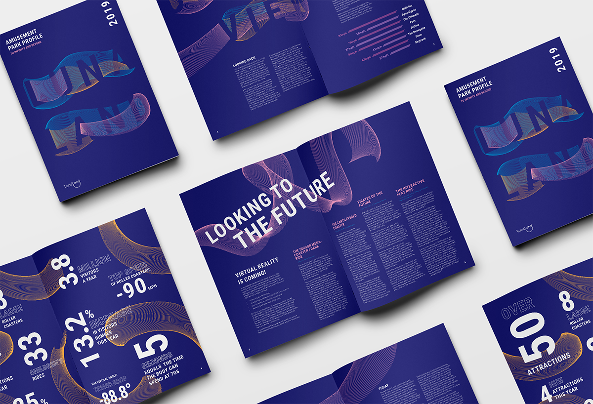
Lunaland Report, Gold in Book Design 2020, Non-Pro, Silver in Typography 2020, Non-Pro Awards
“The annual report highlights the amusement park’s achievements and future plans for developing modern technology of rides. The graphic elements are inspired by the adrenaline that occurs when riding on steep curves and sharp movements of park rides.”
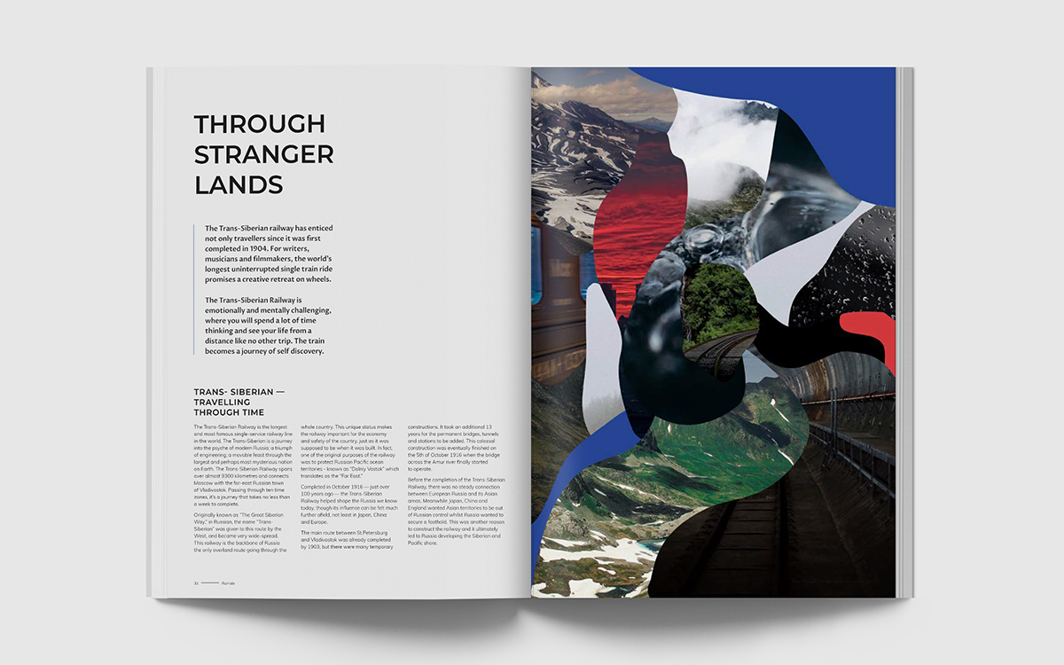
Ramble Magazine, Gold in Magazine & Newspaper Design 2020, Non-Pro, Silver in Digital Art 2020, Non-Pro Awards
“Ramble magazine is a collection of travel guides and stories that explore unconventional travel destinations. The cover artwork is inspired by the experience of assimilating of our surroundings and emotions during travelling. The featured article writes about the ‘forever’ train ride across Russia—the Trans-Siberian Railway, therefore the artworks in the article are inspired by Russia’s landscapes.”
Suzannah James, Shillington Graduate
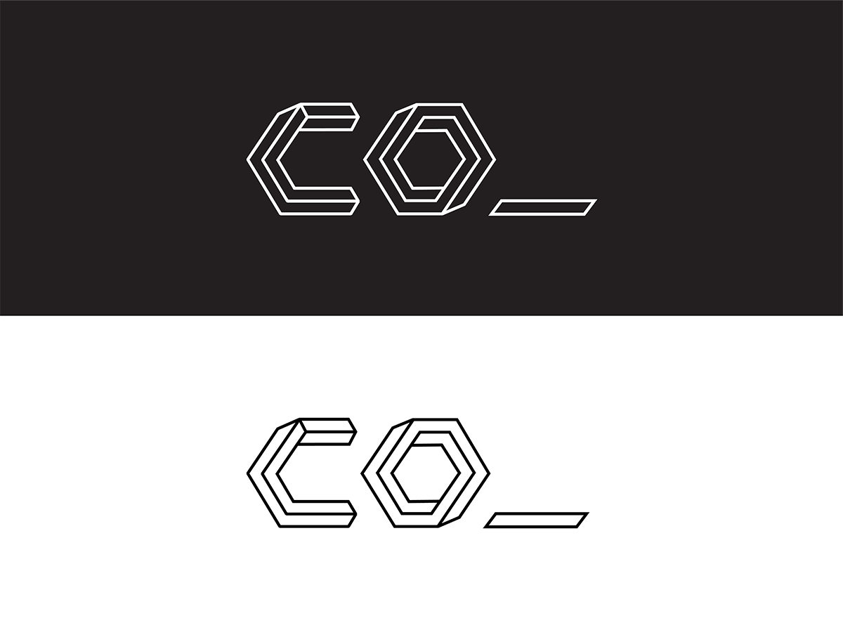
Co-working Brand Identity, Silver in Branding 2020, Non-Pro Award
“The brief was to create a brand identity for a community-led creative co-work. The name ‘co_’ came about from initial brainstorming where many words with a ‘co-‘ prefix kept coming up—words such as community, collaboration, connection, collective etc. I thought this would make a powerful and flexible name so that you could have extensions of the brand such as ‘co_lab—a design studio or ‘co_play’—a Friday night drinks event.”
Sarah Malik and Cali Mackrill, Shillington Graduates
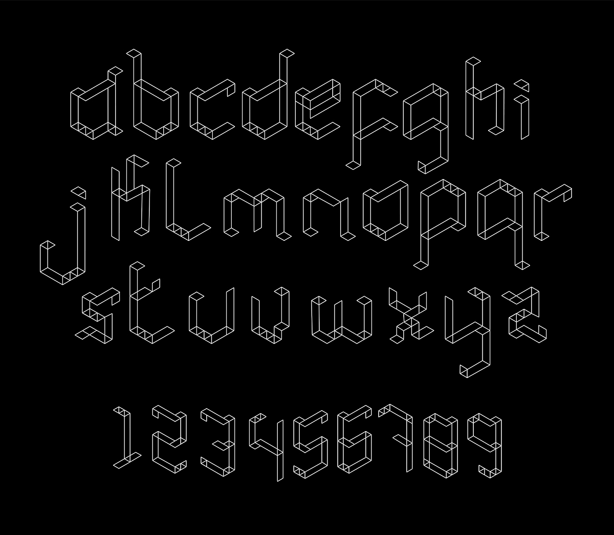
Impossible typeface, Silver in Lettering 2020
“Typeface design inspired by MS Escher’s impossible staircases.”
Alan Barba, Shillington Teacher
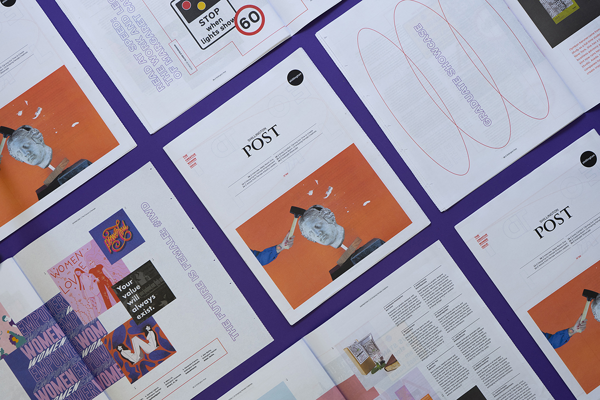
Shillington Post 08 (The Creative Women Issue), Gold in Magazine & Newspaper Design 2020 Award
“The eighth issue of the Post celebrates creative women. In this edition of the Post, twelve female industry leaders give their advice for the next generation of designers—regardless of gender. There are interviews, case studies, inspirational content, student features and much more.”
Shanti Sparrow, Northern Hemisphere Director
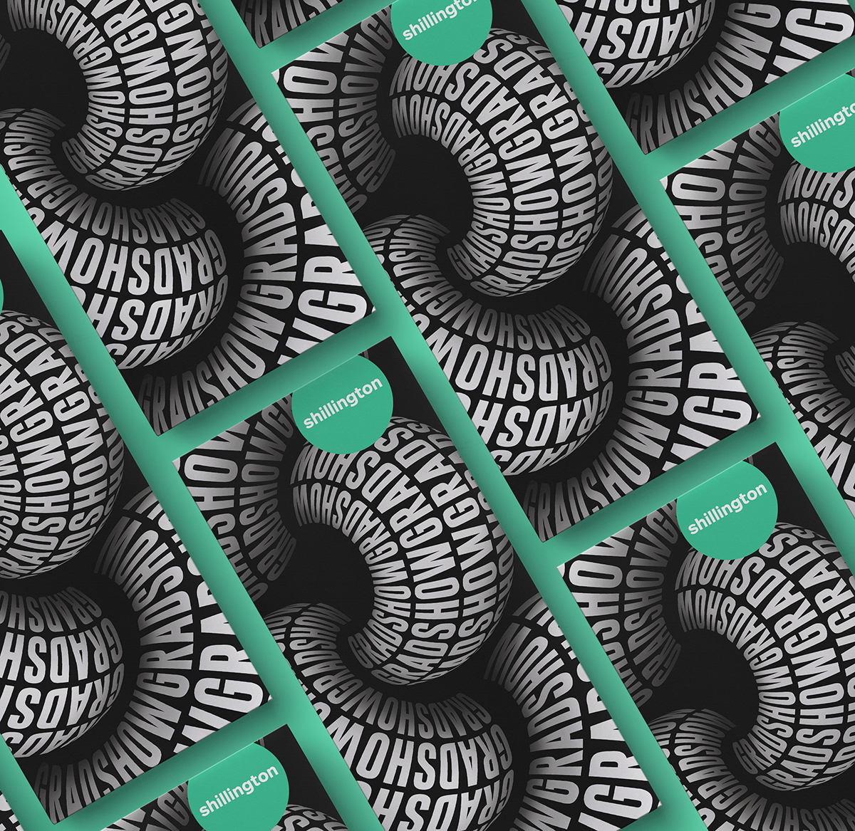
Linked Graduation Exhibition Identity, Gold in Branding 2020 Award
“The “Linked” event identity was developed for the Shillington School of Design Spring graduation exhibitions. Based off the Henry Ford quote “Coming together is a beginning. Keeping together is progress. Working together is success.” The visuals are inspired by teamwork and the extraordinary force of passionate people working toward a common vision. It is also representative of the strong bonds formed between teachers and students throughout the course.”
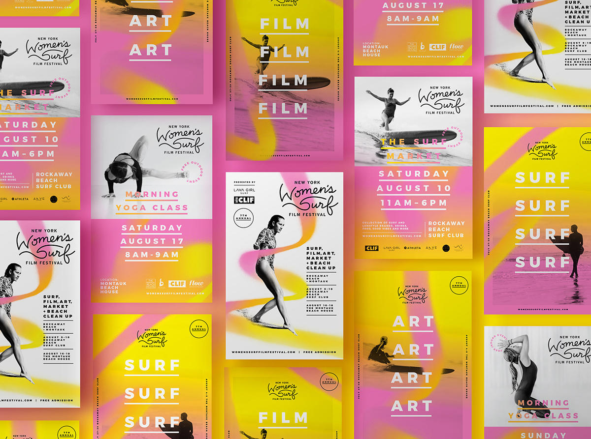
New York Women’s Surf Film Festival, Gold in Branding 2020 Award
“The New York Women’s Surf Film Festival, a project of Lava Girl Surf, celebrates the filmmakers and female wave riders who live to surf, highlighting their sense of adventure, connection to the ocean and love for their own communities and those they discover. The festival is held over 8 days in two cities and includes beach clean-ups, yoga sessions, art shows, markets, surfing and film screenings.”
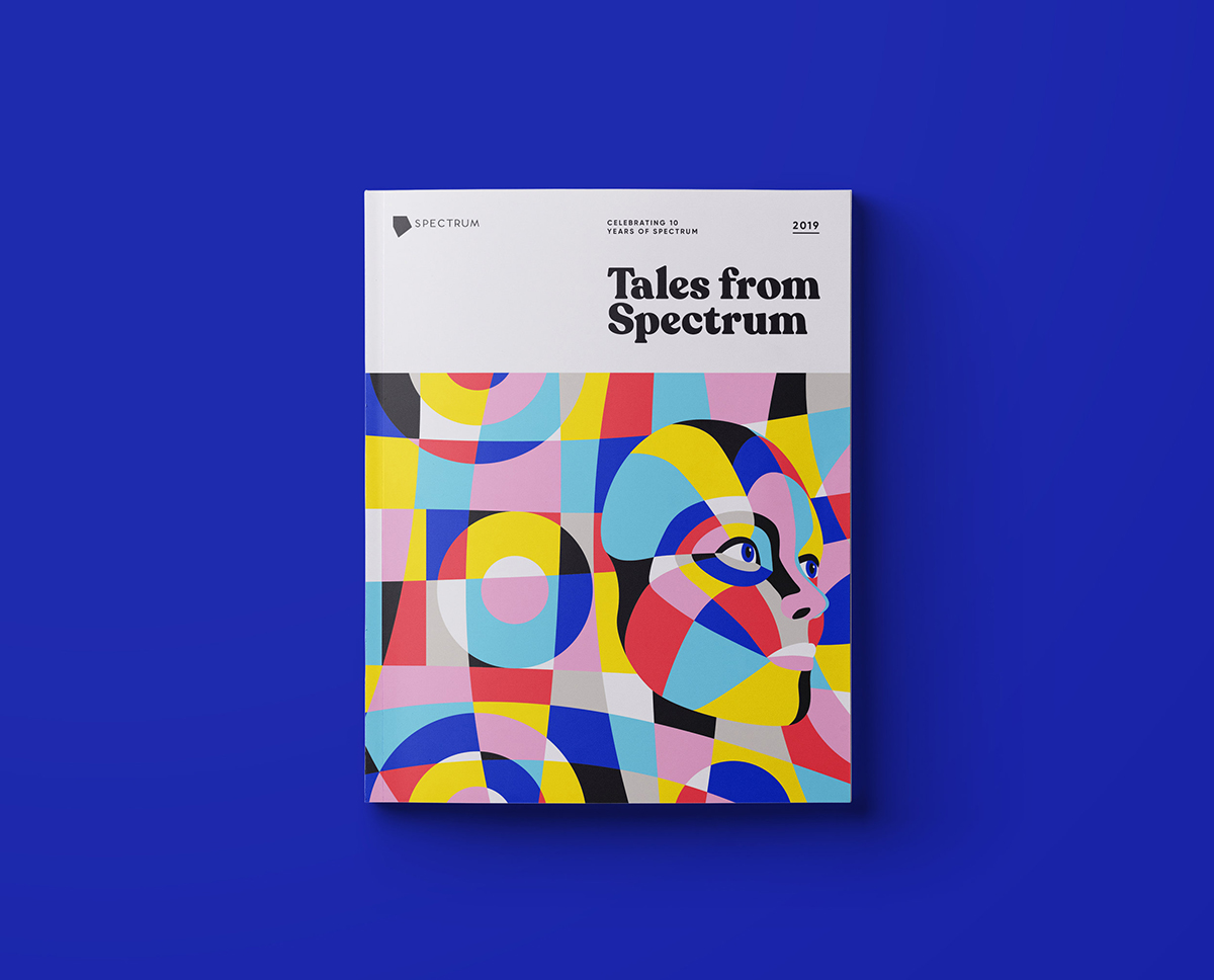
Tales from Spectrum, Gold in Magazine & Newspaper Design 2020 Award
“The design of the book was informed by two key ideas within autism research; camouflage and detail-oriented focus. Camouflage refers to someone with autism both unintentionally or intentionally blending in with their peers. Within the design of the cover a face is camouflaged alongside the number 10 in reference to Spectrums anniversary. The second theme is inspired by the way those with autism process the world—detail-oriented focus.”
Anthony Wood, Global Managing Director
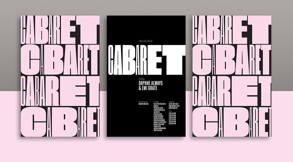
Cabaret, Gold in Typography 2020, Silver in Mix Media/Moving Image 2020, Silver in Promotional Materials 2020, Silver in Branding 2020 Awards
“Branding and animation for the Pincus Haus production of Cabaret the musical. Behind the glamor of the Kit Kat Club, Cabaret is a devastating critique of apathy and a terrifying look at totalitarianism. The variation on typography through animation represents how quickly inaction can take a light-hearted situation into a deep and dark world of devastation.”
Jimmy Muldoon, Shillington Teacher
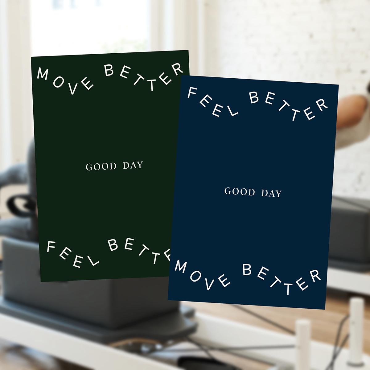
Good Day Pilates, Bronze in Branding 2020 Award
“Good Day is a New York-based pilates studio. All classes are designed by Australia Physiotherapists so you can move better and feel better. I was asked to create a brand identity that displays the knowledge that goes into each class.”
We’re so proud of our Shillington graduates and teachers! For more, be sure to check out the Indigo Award Winners from 2019 and the 20 Shillington Student and Teacher Winners of the 2019 American Graphic Design Awards.
Posts you might like

One of the best things about graphic design is that it never stands still for a moment. But that does mean that keeping up with...

The best graphic design books can take you on an exciting journey of the imagination, transport you to new creative worlds or...

At Shillington, our dedicated graphic design students are taught all about how to design for packaging—from FMCG (that’s fast...

At Shillington, our graphic design course teaches students how to design campaigns for a brand, helping to spread its message....
Exposing yourself to examples of good graphic design is a healthy practice no matter who you are. Maybe you’re a student...
At Shillington, our graphic design bootcamp students are taught how to design for digital, incorporating aspects of both UI and...
We love graphic design. And we're guessing, as you're here, you love graphic design too. This means that we all love graphic...
In graphic design, quite a few decisions happen behind the scenes that clients may not grasp the importance of, yet have a huge...
Want to win some amazing prizes and stay in the loop with all things Shillington? Sign up to our newsletter to automatically go in the draw.