Jan Tschichold: Famous German Calligrapher, Typographer & Book Designer
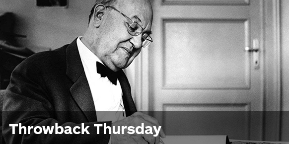
Jan Tschichold (1902–1974)
Born in Leipzig, Germany—Jan Tschichold is one of the most influential typographers of the 20th Century. A master in his field, he was an accomplished designer, writer and teacher. It’s an understatement to say he was aware of his own eminence. In 1972, on his 70th birthday Tschichold wrote a tribute to himself, “Two men stand out as the most powerful influences on 20th-century typography: Stanley Morison, who died in 1967, and Jan Tschichold.”
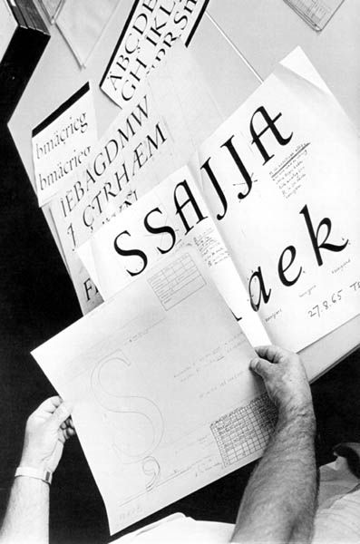
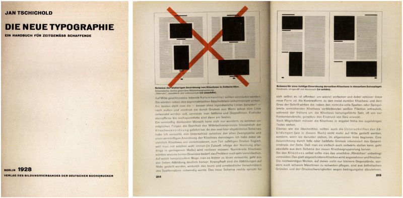
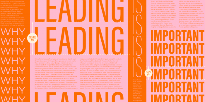
Exposed to typography at an early age, Tschichold’s father was a script writer and trained in calligraphy. His first major work Die Neue Typography—published in 1928—defined modernist typographic ideas. In it, he condemned all typefaces except sans-serif, advocated for standardization of paper sizes and guidelines for establishing a typographic hierarchy in design. Despite returning to a classicist theory later in his career, The New Typography shows an attention to detail and focus on communication that has proven to be lasting.
“Good typography can never be humorous. It is precisely the opposite of adventure.”
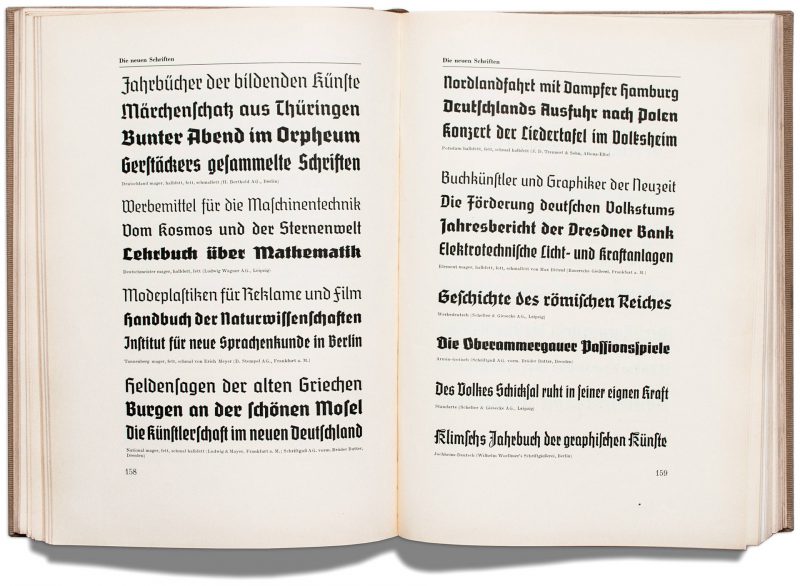
A controversial figure, known for his strong ideological and artistic stances—Tschichold was taken into protective custody ten days after the Nazis rose to power in 1933. His emphasis on new typography and sans-serif type was deemed a threat to the cultural heritage of Germany—that traditionally used Blackletter typography.
 After four weeks in prison, the Nazis seized much of his work and with no prospect of work in Germany—Tschichold and his family soon took refuge in Switzerland. With an established reputation and connections with the School of Arts and Crafts in Basel, Tschichold soon returned to teaching, designing, curating exhibitions and writing.

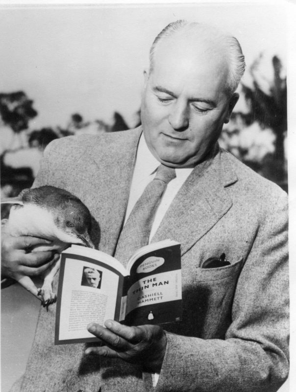
With the resurgence in popularity of the Penguin paperback today—Jan Tschichold has returned to prominence with a much wider audience. In his work for Penguin he standardised their cover designs. As we take a look back through the chronology, we get a stunning insight into the refashioning of Penguin through Tschichold’s original notes and sketches.
 Founded in 1935, Penguin had transformed the economics of British publishing by making high culture available to the mass public and selling “good books cheap”. As a champion of the modern typographic style—Tschichold caught the eye of founder Allen Lane. Not wanting to compromise on quality, Lane met Tschichold in Basel and from 1947 the publishing house had a new designer.
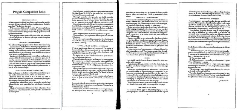
 ![]() From 1947-1949 Tschichold personally oversaw the development of more than 500 books. As the Head of Typography and Production, he developed the Penguin Composition Rules—a four-page booklet to standardize formats and typographic specifications. In his examinations addressed composition, spelling, grammar, stylization—as well as the printing of plays and poetry. The Penguin Composition Rules played an important role in unifying the design of the Penguin series. Prior to this, different printers would mildly aim to have books they print look akin to the Penguin family. The new, refined Penguin brought harmony and economy to its publishing program, no matter the print foundry.
From 1947-1949 Tschichold personally oversaw the development of more than 500 books. As the Head of Typography and Production, he developed the Penguin Composition Rules—a four-page booklet to standardize formats and typographic specifications. In his examinations addressed composition, spelling, grammar, stylization—as well as the printing of plays and poetry. The Penguin Composition Rules played an important role in unifying the design of the Penguin series. Prior to this, different printers would mildly aim to have books they print look akin to the Penguin family. The new, refined Penguin brought harmony and economy to its publishing program, no matter the print foundry.
Accompanying the Penguin Composition Rules was the implementation of a grid system—unalterable instructions that set a pragmatic foundation for all the Penguin series. This included the trimmed page area, width and height of each book, visual cover size, type area on cover and spine, position and style of the spine label and lettering on labels for all the covers. The grid gave Tschichold the flexibility to create appropriate scale relationships between the typography and dimensions of each book.
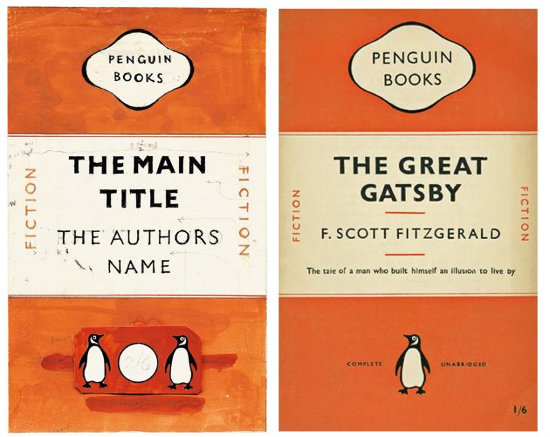
In his view, adherence to the tenets of classical typography were all integral to a book’s timeless function. Tschichold decided to simplify the design by exclusively typesetting the Penguin series in Gill Sans. He gave more attention and care to the tracking and kerning of text.
“…I had a rubber stamp made: ‘Equalize letter-spaces according to their visual value’…”
He incorporated elements like the subtle horizontal rule—that was introduced to break apart elements on each cover. The changes he made weren’t huge. Tschichold realised all that was needed was more attention to detail and care. He cared about the way a book opened. How comfortable it felt in the hand. He considered the weight and grain-direction of paper, stiffness or flexibility of cover boards and binding.
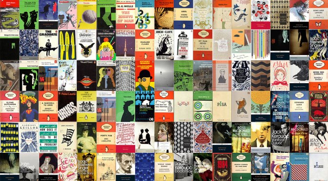
Ever since Penguin published their first paperback in 1935, they’ve gone on to create some of the most iconic book covers in history. Tschichold was committed to a design philosophy of colour—orange was for fiction, green was for crime and blue was for biography—grid and typography. This improved the consistency and readability of a large number of titles in the Penguin catalog.
“We do not need pretentious books for the wealthy, we need more really well-made ordinary books.”
Jan Tschichold embraced extremes and as a result has left an impression on the world of graphic design. Throughout the different stages of his career, he has left a lasting impression on how designers think about and use typography—and it will continue to affect them into the future.
You can read more about Jan Tschichold in the Letters from the Hellbox series of articles by designer and writer Martin McClellan. Learn about the evolution of the Penguin logo and view a personal collection of classic covers. For more book cover inspiration check out the Book Cover Archive.
Posts you might like

The best graphic design books can take you on an exciting journey of the imagination, transport you to new creative worlds or...
In graphic design, quite a few decisions happen behind the scenes that clients may not grasp the importance of, yet have a huge...

It’s that time of year again! As the new year approaches, it’s become somewhat of a tradition for us to look back at our...
We all know that sometimes finding the perfect typography for a design project can be like finding a needle in a...
Dipped your toes into the world of graphic design? You'll know that typography is something that underpins almost every aspect...
Considering how much the world has changed since this time last year, making general predictions for what the next 12 months have...

Whether you’re a student or a recent graduate, living on a tight budget means looking for savings wherever you can, including...
Aaron Douglas was a leading artist of the Harlem Renaissance, also known as the New Negro Movement. Douglas, along with the...
Want to win some amazing prizes and stay in the loop with all things Shillington? Sign up to our newsletter to automatically go in the draw.