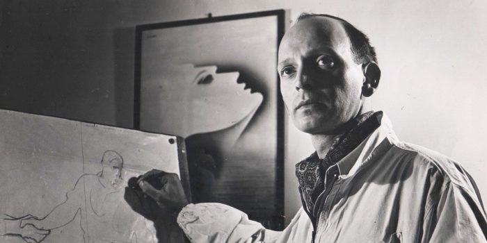
Quick Design History: Jurriaan Schrofer #ThrowbackThursday
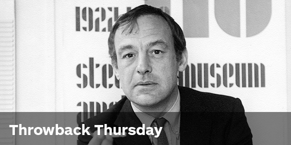
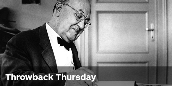
Jurriaan Schrofer (1926–90)
In our Throwback Thursday series we often feature the more famed designers of the past—familiar names that are so regularly quoted when the topic of graphic design arises. This week’s focus Jurriaan Schrofer however is a lot less celebrated than his contemporaries, which is a huge shame given that his typography is an absolute triumph.
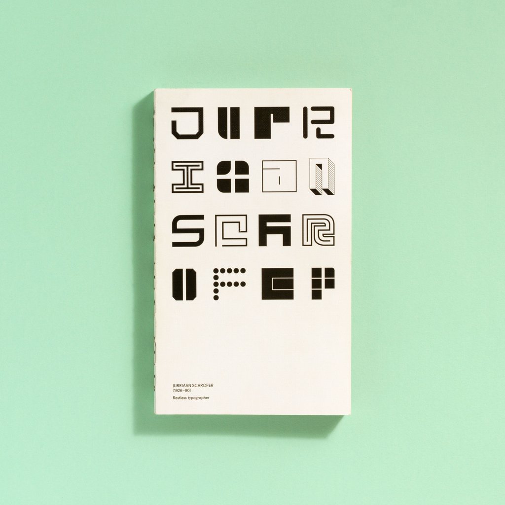
Despite being hidden away, remaining virtually unknown outside of the Netherlands for many years, the industry has now spoken and more and more designers are shedding light on Schrofer’s brilliant contribution to graphic design. Adrian Shaughnessy and Tony Brook of London publishing house Unit Editions produced a marvellous book ‘Restless Typographer‘ in 2013, championing Schrofer’s typography in particular—it’s arguably the launch of this book alongside a handful of others which have now given Schrofer’s remarkable work the exposure it truly deserves.
Originally from the Hague in the Netherlands, Schrofer earned his stripes through an internship with Dick Elffers. Following the conclusion of the Second World War, Schrofer became aquainted with Elffers in Amsterdam. Elffers owned a small print shop and it was here that Schrofer would become his assistant, bettering his skills before moving on to the Meijer Printing House.
Schrofer continued his career into publication design, working on some of The Netherlands largest publications of the time such as Forum Magazine. He also had a number of major clients including the National Post Office and the Stedelijk Museum during his time as a partner alongside Wim Crouwel at the prestigious Total Design studio during the 1960’s.
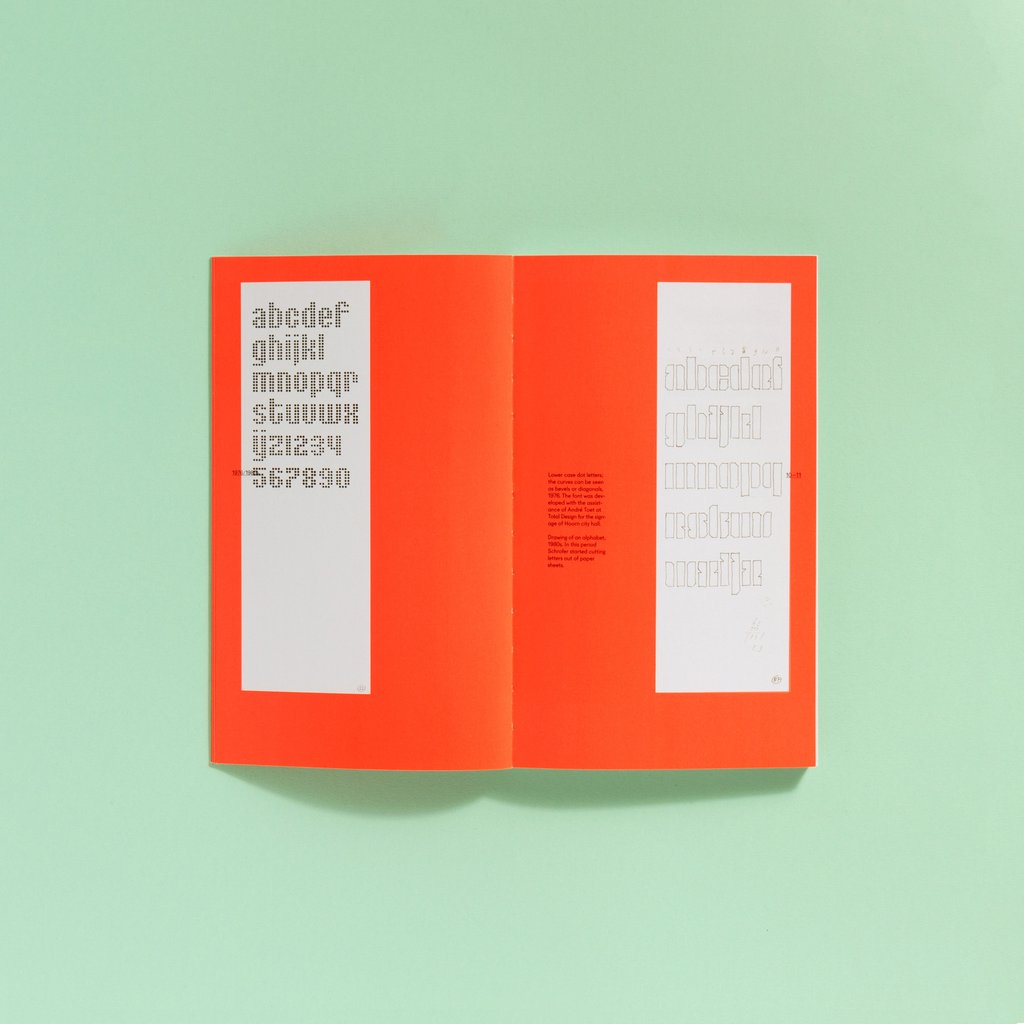
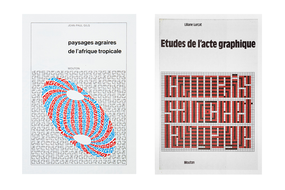
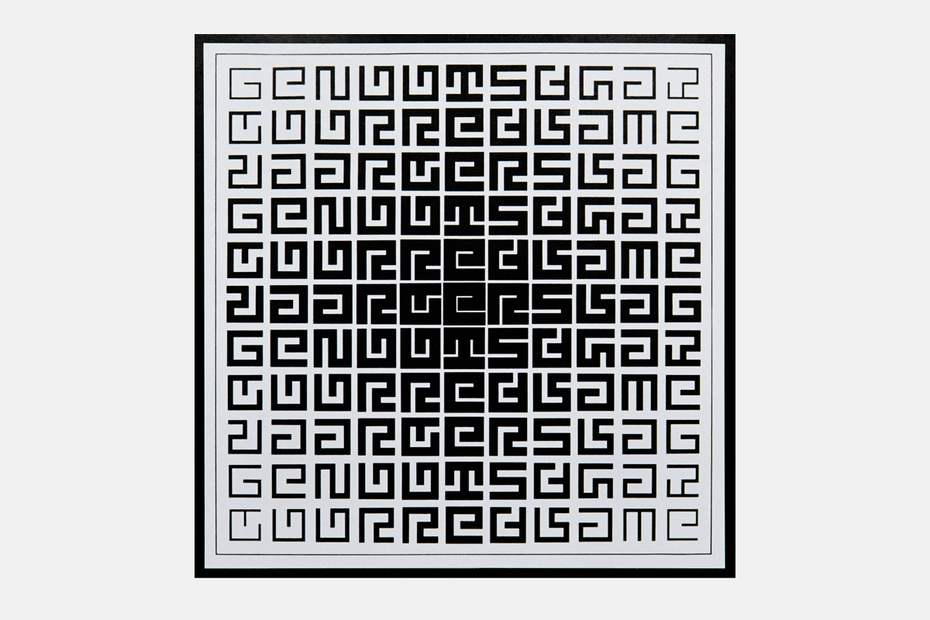
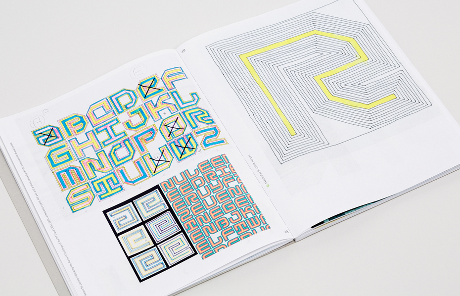
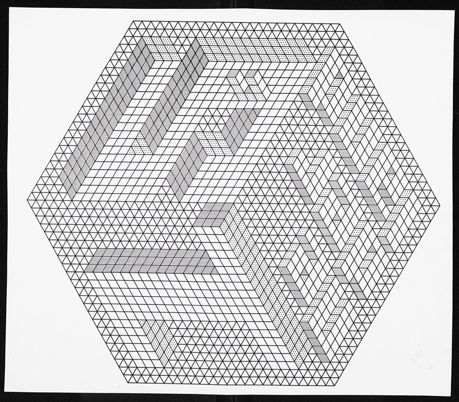
Schrofer’s series for Mouton publishers is perhaps deemed his most exciting work. Full of experimentation, the covers were reminiscent of Op Art by the likes of M.C Escher which provided inspiration for Schrofer. This approach to design, led Schrofer to produce a multitude of wonderful typefaces—typefaces which were tailor made given that they rarely contained capital letters or had a full character set, they simply existed for the task he initially designed them for. Schrofer’s design process involved masses of explorative drawings using graph paper, pens and highlighters as well as Letraset-like transfer sheets which helped to simplify his often complex creations.
Schofer’s drawing style is captivating. He would painstakingly create all of his typography by hand. A book titled ‘Schrofer Sketches’ by Joost Grootens cleverly brings Schrofer’s drawings to life by using specific flourescent inks in the printing process to emulate what the sketchbook of Schrofer may have looked like. While his drawings can now be more easily replicated through the help of a computer we can’t help but marvel at Schrofer’s creations—especially for the time in which they were created.
 Despite being less publicised than some of his contemporaries, in a book titled ‘Zienderogen’ (In Front of Eyes) published just two years before his death in 1990, Schrofer contributed greatly to the content sharing lots of personal details in particular a letter written to his son Gillian (now a well known industrial and interior designer) surrounding advice about which career path to take. Schrofer explains what being a designer meant to him;
“A graphic designer embodies the art of storytelling through the implementation of written communication between people.”
Schrofer repeatedly analysed the concept of design throughout his career, explaining further in the letter to his son that he believed Design to be about the, ‘pre-formulation, plan, scheme, strategy, intention, the first sketch, the general idea.’ He continued to proclaim,
“The design that I would like to define is associated with a different object than art (…) I do not trust designers who call themselves artists.”
Dutch Biographer, Frederike Huygen has written extensively about Schrofer’s outlook and approach to Design. Eye magazine provided further content relating to this into this within a recent article about Jurriaan Schrofer.
Regardless of how well known he is, it’s abundantly clear that Jurriaan Schrofer’s work is just as important to our design history as all the other greats which are more heavily celebrated from the prolific era from which they came. His contribution to design will be forever adored by generations of type enthusiasts, and now hopefully shared a little bit more amongst a wider audience!
We have lots of other great design history pieces over in our Throwback Thursday category. Keep an eye on the blog for a new feature in the coming weeks!
Posts you might like
Aaron Douglas was a leading artist of the Harlem Renaissance, also known as the New Negro Movement. Douglas, along with the...
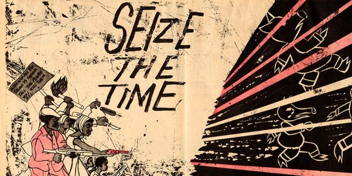
Emory Douglas is an American graphic designer most notably known for his time as Minister of Culture for the Black Panther Party...
On Thursdays at Shillington, our teachers like to take their class back in time and introduce some of their favourite graphic...

This edition of Throwback Thursday is perhaps more of a fusion with #ILoveTheseGuys. While Kyle Cooper isn't the oldest of...
Matthew Carter (b. 1937) Matthew Carter is arguably the world’s most widely read designer. If you don’t recognise his...
Alexey Brodovitch (1898–1971) Following Fashion week it seems only right to dedicate this month's Throwback Thursday to one...
Louise Fili (b. 1951) Louise Fili is a highly acclaimed graphic designer, best known for her handwritten type. She is a...
Jan Tschichold (1902–1974) Born in Leipzig, Germany—Jan Tschichold is one of the most influential typographers of the 20th...
Want to win some amazing prizes and stay in the loop with all things Shillington? Sign up to our newsletter to automatically go in the draw.