Kyle Cooper: An American Graphic Designer With a Speciality in Main Title Sequence Work for Major Motion Pictures

This edition of Throwback Thursday is perhaps more of a fusion with #ILoveTheseGuys. While Kyle Cooper isn’t the oldest of designers he’s been trained by the greats and has fast become the king of modern title design for TV and Film, often compared to legendary designer Saul Bass.
Cooper trained at Yale under design royalty Paul Rand, known for his illustrious career in Advertising. Following graduation in 1988 for an MFA in Fine Arts Cooper went on to work as a Creative Director at renowned advertising agency R/GA. It was while working there that he began his journey into film title design and since then he’s produced titles for more than 50 films along with his company Prologue Films.
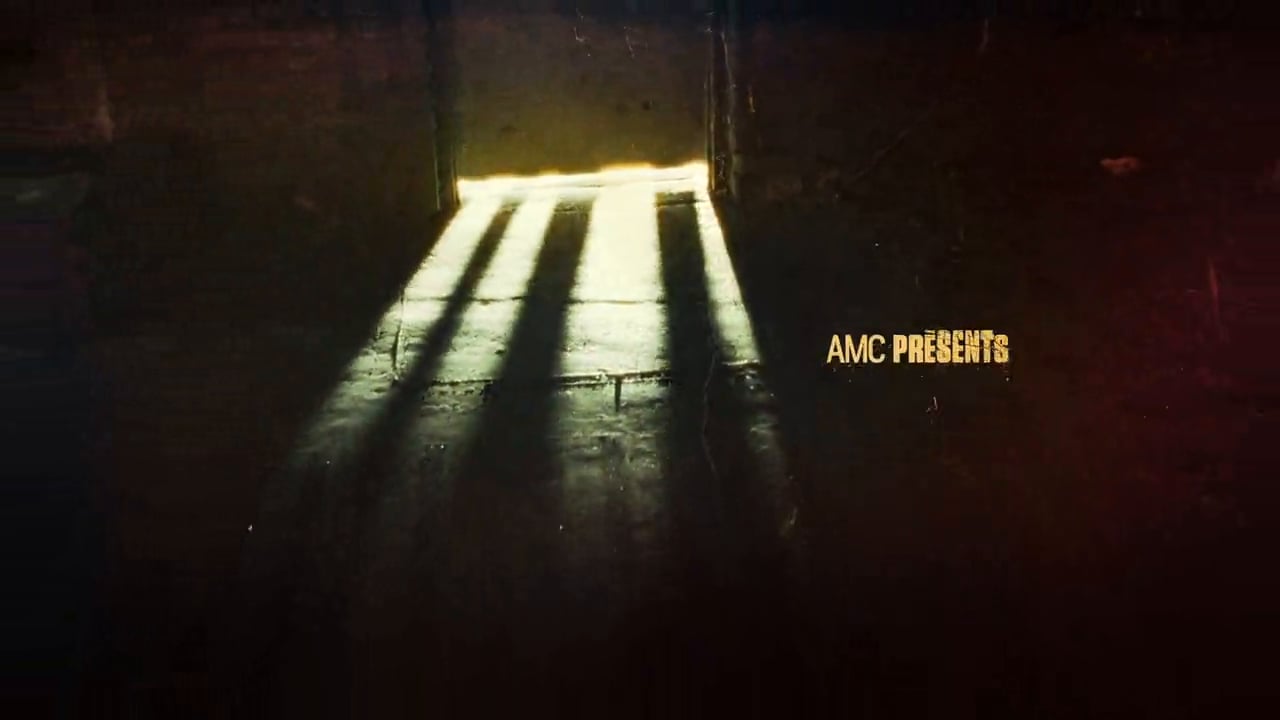
A lot of Cooper’s work has been for horror based content such as, Dawn of the Dead, The Walking Dead and American Horror Story. While not limited to this content it’s often some of his most memorable and visceral work. His unique approach taps into the symbolism on the film, by immersing himself in the concept he’s able to produce rich content which represents the very essence of the production.
https://www.youtube.com/watch?v=vuumCteZVBM
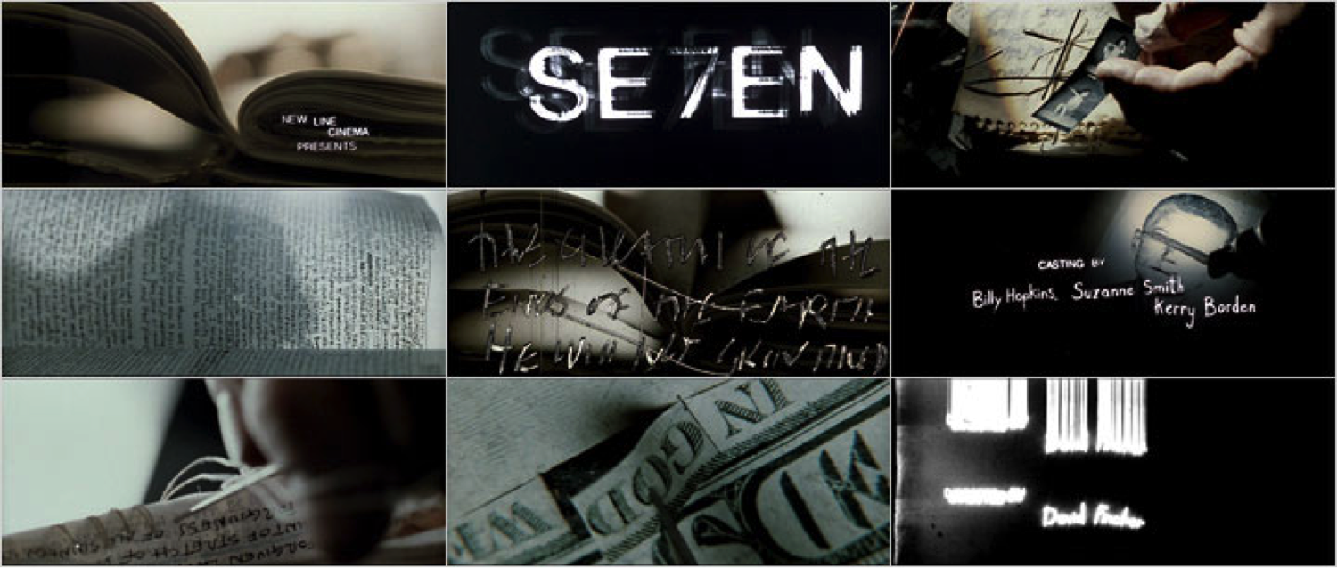
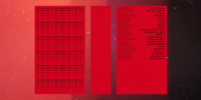
One of my favourite works from Cooper is undoubtedly his creation for Seven. The 1995 film directed by David Fincher is a chilling thriller in which the antagonist (played by Kevin Spacey) leaves a path of grim murder investigations in his wake. It could have been easy for Cooper to run with clichéd ‘gore’ or ‘horror’ type but instead he emulated the obsessive, calculated qualities of the serial killer choosing to scratch the letters into a surface by hand with a needle—that’s one hell of a handmade project!
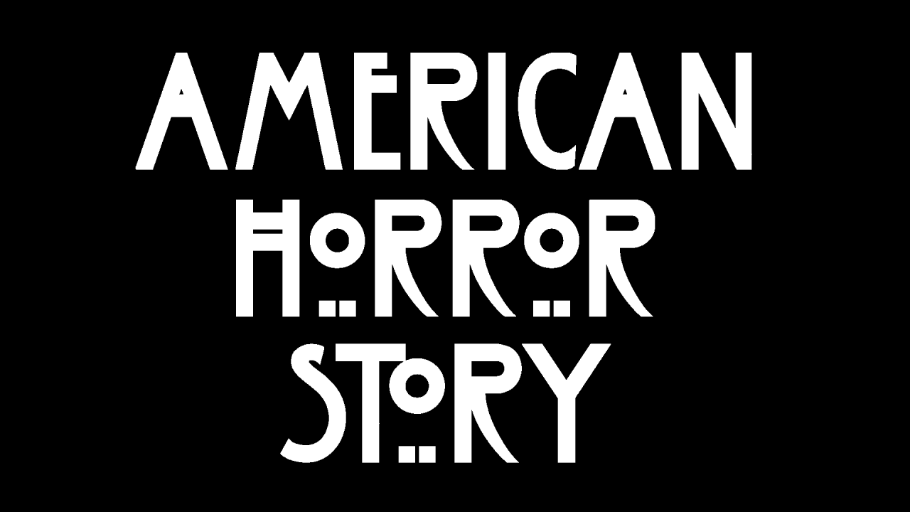
This same approach is evident in his work for American Horror Story. The nail-bitting series by Ryan Murphy is extremely well recognised for its logo and subsequent type face which forms the title sequence. An edited version of the Charles Rennie Mackintosh Font it combines the spookiness of the genre with references to gothic origins, yet still manages to display a certain ornateness.
Cooper strives to achieve emotive qualities within his work, explaining that it’s crucial for the titles to set the precedent for the film;
“Sometimes making people laugh or even making them scared can be accomplished by a good opening sequence.”
Kyle Cooper is a fantastic reference for looking deeper into the subject matter when approaching a new project. Having a concrete concept which references the subject matter will more often than not result in a truly great outcome. Keep an eye out for more of Cooper’s work when you’re next watching a movie or tv show, while his approach is diverse it’s generally identifiable by the acute attention to detail.
If you’re curious to see more of Kyle Cooper’s work head over to The Art of the Title for a full repertoire of his work, along with some of the other well known title designers.
Hungry for more design knowledge? Discover some of design’s most influential figures in our Throwback Thursday category. Our global team has contributed to an extensive library featuring book designer Irma Boom, type aficionado Jan Tschichold and master of icons, Lance Wyman.
Posts you might like
In graphic design, quite a few decisions happen behind the scenes that clients may not grasp the importance of, yet have a huge...
It’s that time of year again! As the new year approaches, it’s become somewhat of a tradition for us to look back at our...
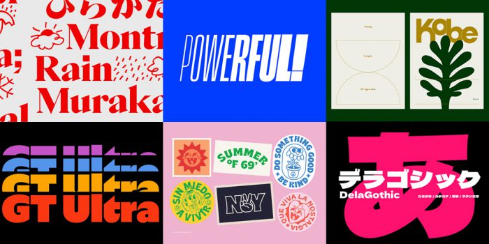
We all know that sometimes finding the perfect typography for a design project can be like finding a needle in a...
Dipped your toes into the world of graphic design? You'll know that typography is something that underpins almost every aspect...
Considering how much the world has changed since this time last year, making general predictions for what the next 12 months have...
Whether you’re a student or a recent graduate, living on a tight budget means looking for savings wherever you can, including...
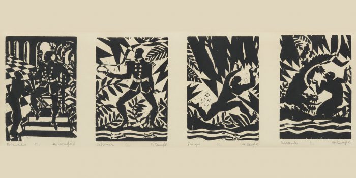
Aaron Douglas was a leading artist of the Harlem Renaissance, also known as the New Negro Movement. Douglas, along with the...

You need some typography for your project and you're on a tight budget. You'd love that stunning sans serif or stylish...
Want to win some amazing prizes and stay in the loop with all things Shillington? Sign up to our newsletter to automatically go in the draw.